 DramaRemix
Watch a story.
Make it your own.
Interactive short dramas · AI-assisted story creation

Project overview
DramaRemix is an interactive short-drama app where viewers can watch, choose, and create. At key story moments, they can follow the original plot, explore another branch, or use AI to create a new video storyline with the same characters and story world.
Fans can watch each other’s branches and share their own versions. The product brings AI-assisted creation into the viewing experience, turning an idea for a different story into something others can watch.
Team & my role
- Designer · me
- 1
- Product manager
- 1
- Engineers
- 3
As the team’s UI / UX Design Intern, I worked with a product manager and three engineers, moving from building the interface to improving the creation experience.
First, I built the UI foundation from scratch. I translated the product team’s requirements into page layouts, content hierarchy, reusable components, and interface states. The challenge was designing the full set of pages while keeping the experience consistent.
Later, I independently reviewed the Personal Center and creation flow. I investigated where people hesitated or lost their way, then used those findings to refine creation steps, generation feedback, and how users find and manage their work—with the goal of reducing barriers to creating.
- Design review
- User research · interviews
- UI foundation · v1
- Creation Center
- Personal Center
- Topics & collections
Bars start on the real dates; short ones are widened to fit their label. After launch: the Personal Center iteration, and topics & collections v1 — designed during the internship.
- Before launch
- After launch
My contribution
0 → 1
Built the UI foundation
Turned product requirements into page layouts, reusable components, and interface states.
- 15
- Usability-test participants
- Sessions I moderated to investigate task barriers.
- 2
- Core experiences refined
- Creation flow and Personal Center, from review to redesign.
UI system: 7 specification boards · 44 icon assets & variants · 16 core color tokens · 6 text styles.
Phase 01
Design System & Pre-launch UI
The product team had defined the requirements. My challenge was to turn them into a full set of interfaces—with a shared foundation that could hold the app together.
Phase 1 · Evaluation
Design Review
Review approach
Understand the experience.
Decide what needs attention first.
We reviewed the existing design together, then used user feedback to clarify the priorities.
- 01
Review the design. Walk through the key tasks and screens together.
- 02
Record observations. Note unclear interactions, states, and inconsistent patterns.
- 03
Validate with users. Turn the observations into questions for user testing.
- 04
Set priorities. Address task-blocking issues first, then refine local UI details.
Phase 1 · Research
Usability Test Results
I moderated usability testing with 15 participants to assess how these issues affected key tasks: watching, choosing, and creating.
15participants, moderated by me
12issues from review and testing
3insights that set the priorities
Moderated usability testing · late June – July 2026 · tasks drawn from the design review
Major · Blocks task completion
Finding 03 · Creation Center
Users do not know how to continue creating.
- 01
An unclear sequence
Story context, creative choices, and generation controls compete for attention.
- 02
Uncertain system state
Generation stages, credit use, and the effect of refreshing need clearer explanations.
Task impact — Not knowing what to do next can stop the creation task entirely.
1 / 5 · Creation Center → Story choices → Story tree → Personal Center → Playback & entry
Key Findings
Insight 01
Users didn’t know what to do next.
Tags, story context, and controls asked for attention at once.
One step at a time
Insight 02
Users couldn’t tell what the AI was doing.
Generation stages, credit use, and refresh effects were unclear.
Clear generation status
Insight 03
The same elements looked different everywhere.
Tags, view counts, and buttons followed no shared rules.
A shared UI system
Phase 1 · Foundation
Design System
My first task was to give the product requirements a consistent interface. I built reusable components, text styles, colors, and states so that each new page could draw from the same foundation.
From tokens to components
- Core color tokens
- 16
- Specification boards
- 7
- Icon assets & variants
- 44
- Text styles
- 6
Color
Core tokens · selected from 63 paint definitions in the source files
Brand
Brand gradient
#FF891B → #FE2C55
Brand icon / unread
#FE2C55
Warning / brand orange
#FF891B
Free viewing
#FFB000
Surface
Base surface
#181818
Dark card
#252525
Divider
#FFFFFF / 5%
Subtle border
#FFFFFF / 12%
Text
Primary text / icons
#FFFFFF
Secondary white
#FFFFFF / 80%
Supporting gray
#9C9C9C
Placeholder white
#FFFFFF / 50%
Feedback
Like
#FF1C41
Error
#FF3D3D
Modal overlay
#000000 / 50%
Skeleton
#5D5D5D → #282828
Typography
Font family
苹方
PingFang SC
Regular / Medium
Type scale
18med
18px · Medium
选择你的故事
Shape your story
16-medium-按钮
16px · Medium
选择你的故事
Shape your story
16-medium
16px · Medium
选择你的故事
Shape your story
16
16px · Regular
选择你的故事
Shape your story
14
14px · Regular
选择你的故事
Shape your story
12
12px · Regular
选择你的故事
Shape your story
Line height
Auto
Applied to all six source text styles.
Font weight
Iconography
24 × 24 px · 44 assets, including variants
 01
01 02
02 03
03 04
04 05
05 06
06 07
07 08
08 09
09 10
10 11
11 12
12 13
13 14
14 15
15 16
16 17
17 18
18 19
19 20
20 21
21 22
22 23
23 24
24 25
25 26
26 27
27 28
28 29
29 30
30 31
31 32
32 33
33 34
34 35
35 36
36 37
37 38
38 39
39 40
40 41
41 42
42 43
43 44
44Original icons and state variants, with source construction guides preserved.
Radius
Corner radius
Compiled from source radius notes and existing components.
4 px
Thumbnail / Badge
8 px
Input / Small cover
12 px
Content card
16 px
Modal card / Large image
Full radius · Buttons & credits
Buttons: 999 / 9999 · Credits: 999
Pill shape · Rendered radius is limited by component height.
Circle · Avatar
50%
Source notes
The radius scale and avatar usage follow the source notes. Button and creation-card values were verified against components. One character image still uses 10 px; historical screens are not fully standardized.
Button
Type & state
Small · 32 px
Primary
Secondary
Disabled
Small · 36 px
Primary
Secondary
Disabled
Medium · 48 px
Primary
Secondary
Disabled
Large · 52 px
Primary
Secondary
Disabled
English-label specimens · Source heights and state treatments.
Full-width source button: 350 × 48 px
Navigation
Selected states
430 × 49 px · 4 destinations
English-label schematic of the four source states.
Loading
Loading indicator
With label / Indicator only · 120 × 120 px
Skeleton · Content loading
Schematic using the source skeleton gradient.
Color · Typography · Iconography · Radius · Buttons · Navigation · Loading
Phase 1 · Screens
UI Design
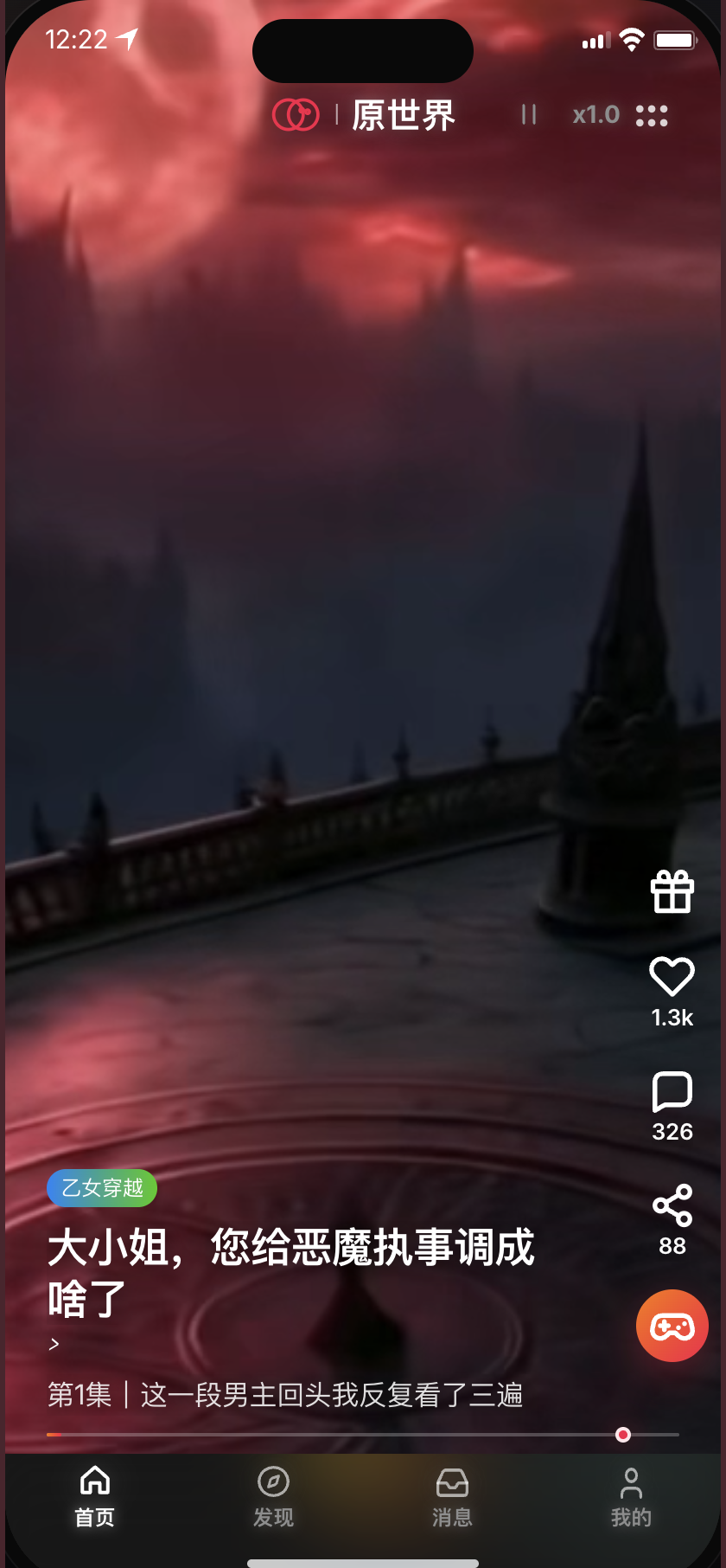
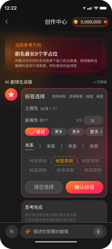
The UI work spanned playback, story choices, discovery, creation, generation states, and the Personal Center. This selection shows the breadth of the earlier interface work; the focused before-and-after comparisons follow in Phase 2.
Interface overview
Phase 1 · What I delivered
Page layouts, reusable components, and interface states—a UI foundation for the product’s first complete experience.
Phase 02
UX Research & Iteration
With the interface established, my focus shifted to the journey through it. I independently reviewed the creation flow and Personal Center, using the findings to refine two parts of the experience.
Phase 2 · Design direction
Design Opportunities
Design focus
Make creation easier to navigate.
The review and user feedback pointed to three areas: creative choices, generation feedback, and returning to personal work.
Each opportunity frames a question for the next iteration.
- 01Creative choices
How might we help people express the story they want to create?
Story context and input controls competed for attention.
- 02System feedback
How might we make progress and cost understandable?
Generation progress and credit use needed clearer explanation.
- 03Personal Center
How might we help people return to their work and saved stories?
Viewing history led the account experience, ahead of creations and saved stories.
Phase 2 · Iteration 01
Creation Flow Iteration
01 / User scenario
Creation Flow
After watching a story, a viewer wants to take its characters in a different direction. The flow needs to help them turn that idea into a brief the AI can use.
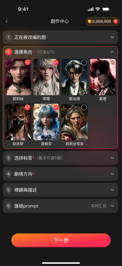
Choose the characters
Start with familiar people from the source story.
Shape the story
Choose a direction and define how the characters interact.
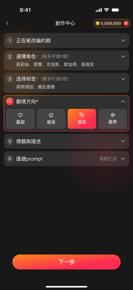
Review before creating
Check the assembled prompt and credit cost before committing.
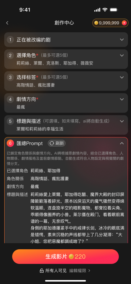
Title and description are optional; AI can generate them from the script. The final prompt brings the choices together for confirmation.
02 / Before & after
Before & After
- Select a change to highlight the corresponding area.
03 / Walkthrough
Interactive Prototype
- 01
Confirm the brief
Prompt and credit cost shown before Create turns on
- 02
See the status
Progress while the AI works
- 03
Recover from failure
The reason first, then a retry
Phase 2 · Iteration 02
Personal Center Iteration
The initial hierarchy prioritized viewing history. I revisited that assumption: creators returned to their work and earnings, while viewers looked for saved stories. The redesign brings creation activity forward and keeps Favorites and History within reach.
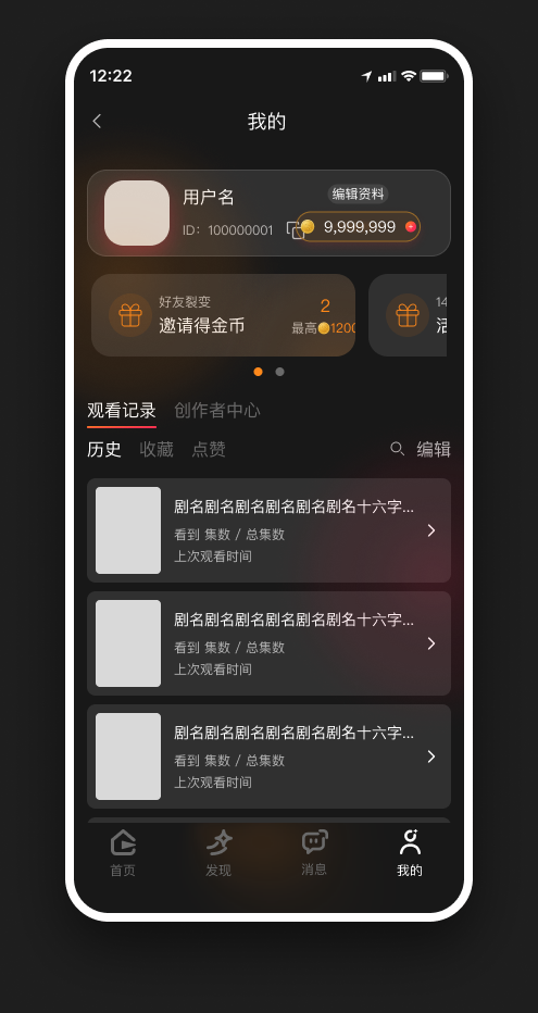
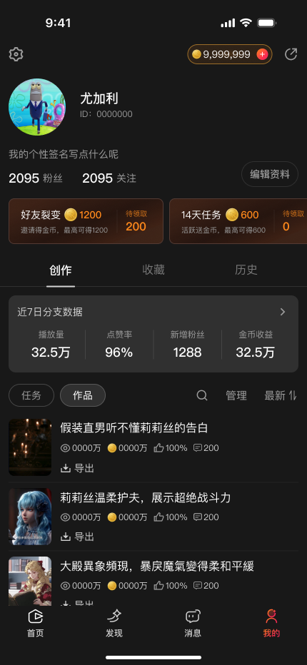
- Select a change to highlight the corresponding area.
03 · Showcase
Final Design
Watch a story, shape a new direction, and return to your creations. A selection of the final interfaces across the product.
01 / Watch & choose
One story.
More possibilities.
Watch, choose a branch, and explore how the story connects.
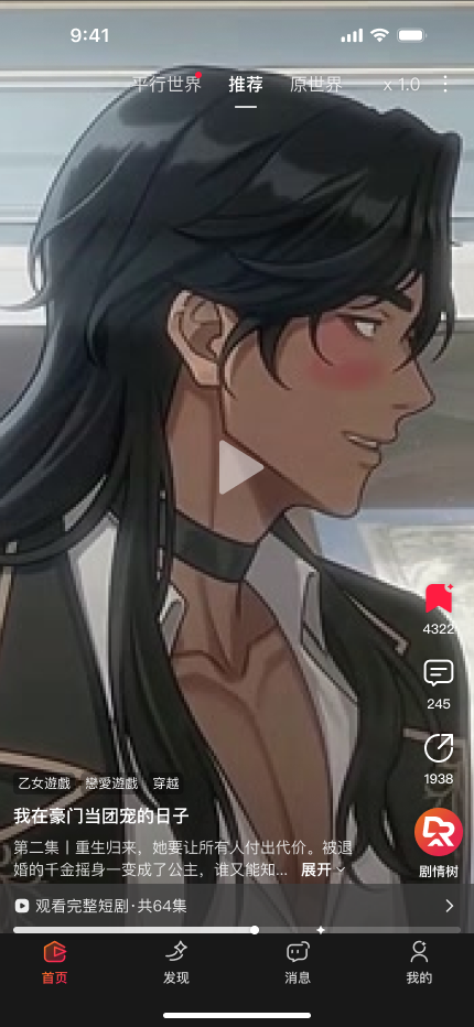
Watch
Watch a story, then explore another direction.
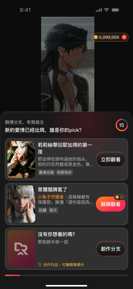
Choose
Explore the available branches at a story moment.
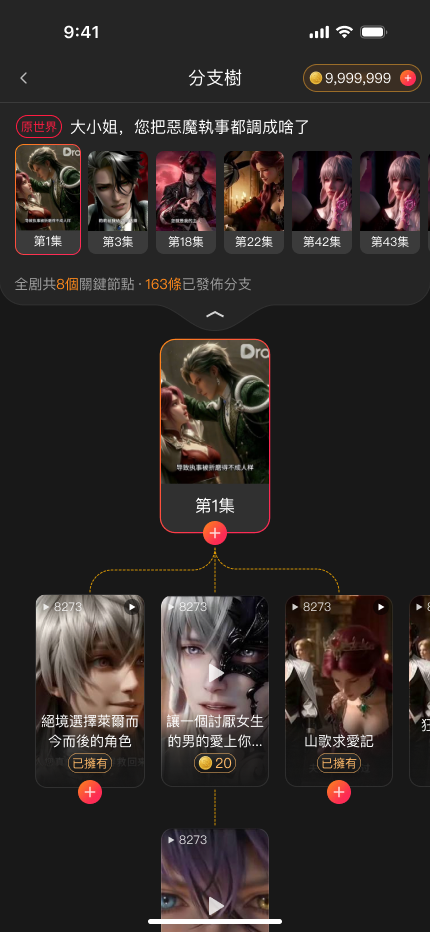
Explore
See how the story branches connect.
02 / Create
Give your idea
a direction.
Characters, story direction, and a final prompt review.
Cast
Start with characters from the original story.
Direct
Choose where the story goes next.
Review
Review the prompt before generating a video.
03 / Return & discover
Your stories.
And what comes next.
Return to your work or find something new to watch.
Your work
Find creations and their performance in one place.
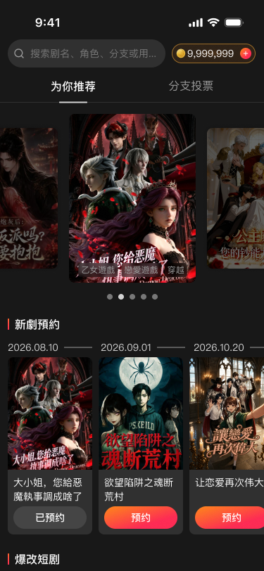
Discover
Browse stories and continue watching.
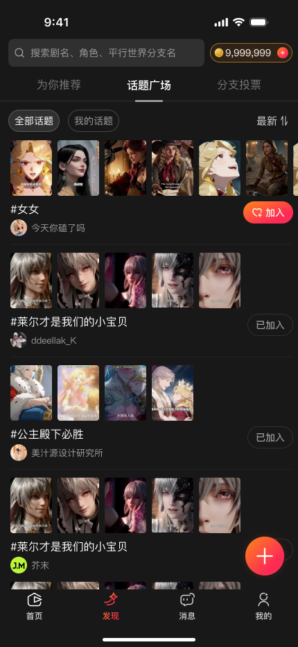
Topics
Explore stories around shared interests.
Selected final product interfaces. The story tree provides product context, outside the iteration work discussed above.
04 · Reflection
Reflection
The work moved from designing a complete interface to examining how its parts supported a person trying to create.
My design work included the app’s UI foundation, page layouts and states, a guided creation flow, and revisions to the Personal Center. The next question I would test is whether those changes make the creation task easier to complete.
What I Learned
01
Make AI feel effortless
AI can create from very little input, but that power should not make the product feel demanding. I learned to distinguish what users need to decide from what the system can handle for them.
Once users have done their part, they need to know that AI is working, what stage it has reached, and whether they need to act. Exposing every processing step adds information without necessarily adding clarity.
02
Design a system at product scale
This internship gave me the time and responsibility to develop branding, tokens, components, and interface states for an entire app. Compared with smaller school projects, maintaining consistency across a complete product was a new challenge.
Building the system from the ground up strengthened my craft and taught me to consider how individual design decisions work together across screens. Creating that foundation was one of the most meaningful achievements of the internship.
03
Keep checking whether creation feels easier
Looking back, the strategic question is how to turn AI capability into an experience people can comfortably use. More guidance is only useful when it helps people express their intent without adding unnecessary work.
I would examine whether the flow lowers the barrier to creation: where users hesitate, which choices they value, and which tasks they would rather leave to AI. That is how I would assess the balance between user control and simplicity.