Pressure instead of support
Unfinished tasks created a sense of failure, making students avoid opening the app.
AI-assisted planner · Mobile app & desktop widget
 The Rookies 2026Web & App Design · Finalist


Project Overview
Noty is an AI-assisted planner for students who find existing task apps overwhelming. In our research, 70% of surveyed students hadn’t found a tool that worked for them. We combined quick voice and photo capture, AI-assisted project breakdown, and satisfying completion feedback to make planning feel as simple as paper.

I designed Noty’s mobile experience, translating our team’s research into task capture, planning, and completion flows. I created wireframes and interactive prototypes in Figma, introduced drag-to-reschedule, and refined the experience through two rounds of usability testing. I also used Claude Code to help build the mobile web app. Across our mobile and desktop concepts, 40 students said they would continue using Noty if it became available.


We compared onboarding, natural-language input, and quick capture in existing tools.
of surveyed students hadn’t found a task-management tool that worked for them.
Unfinished tasks created a sense of failure, making students avoid opening the app.
Checking off a task digitally lacked the sense of accomplishment students felt when crossing it off on paper.
Students set goals beyond their capacity, without manageable steps to help them make progress.
Tasks were recorded, but did not stay visible. Students added them and then lost them from their attention.
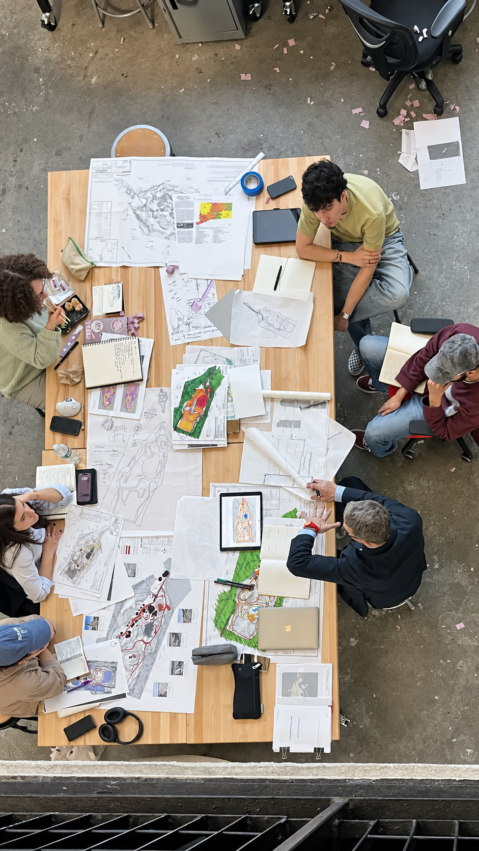
Make everyday planning feel simple, manageable, and as satisfying as pen on paper.

How might we help students create, organize, and manage tasks with less effort and more clarity?
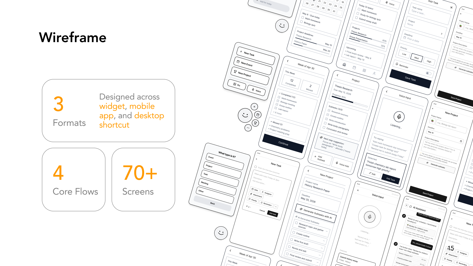
We used quick sketches to explore different interface layouts and try out ideas at low cost.


Type it or say it. Capture a task, review the details, and add it to your plan.
Ask the assistant what to focus on and review suggested steps before adding them to your plan.
Keep today’s tasks in view, grouped by project, with time estimates that make the workload easier to understand.
Describe your project and generate smaller subtasks, then review the steps before moving forward.
Check off completed tasks and look back at your weekly progress, keeping each small accomplishment visible.
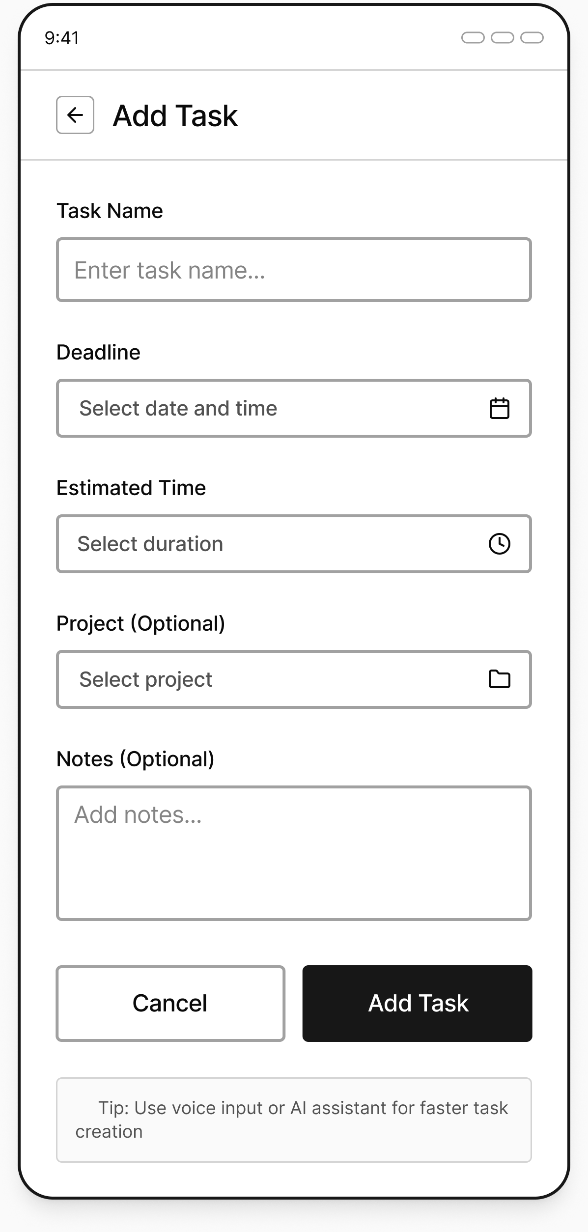
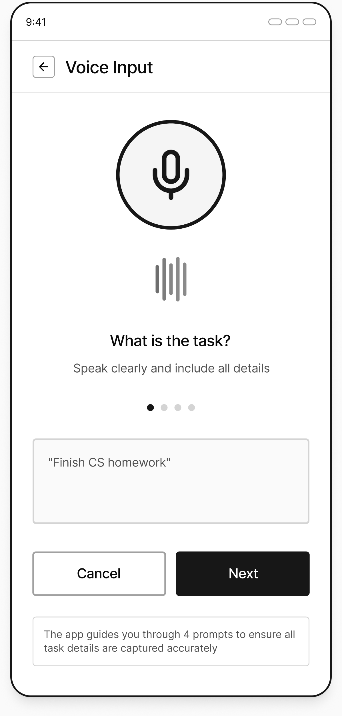
We tested three everyday tasks over two rounds to find usability issues and refine the experience.
Testing #01
Students completed the three tasks without step-by-step guidance. We observed where they hesitated, then gathered usability and recommendation feedback.
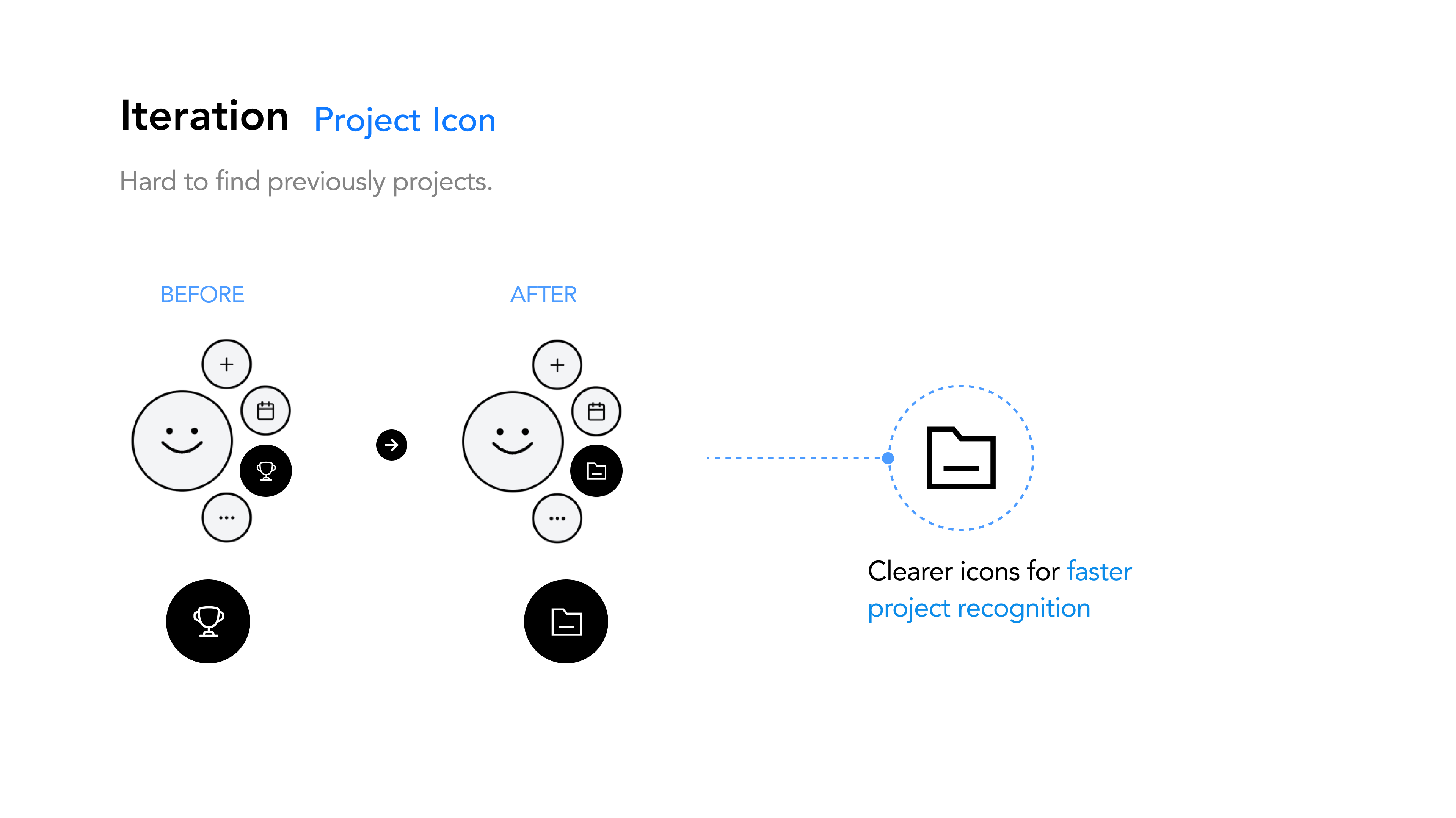
Students could not quickly distinguish previously created projects.
Replaced the ambiguous trophy with a folder icon, making projects faster to recognize.
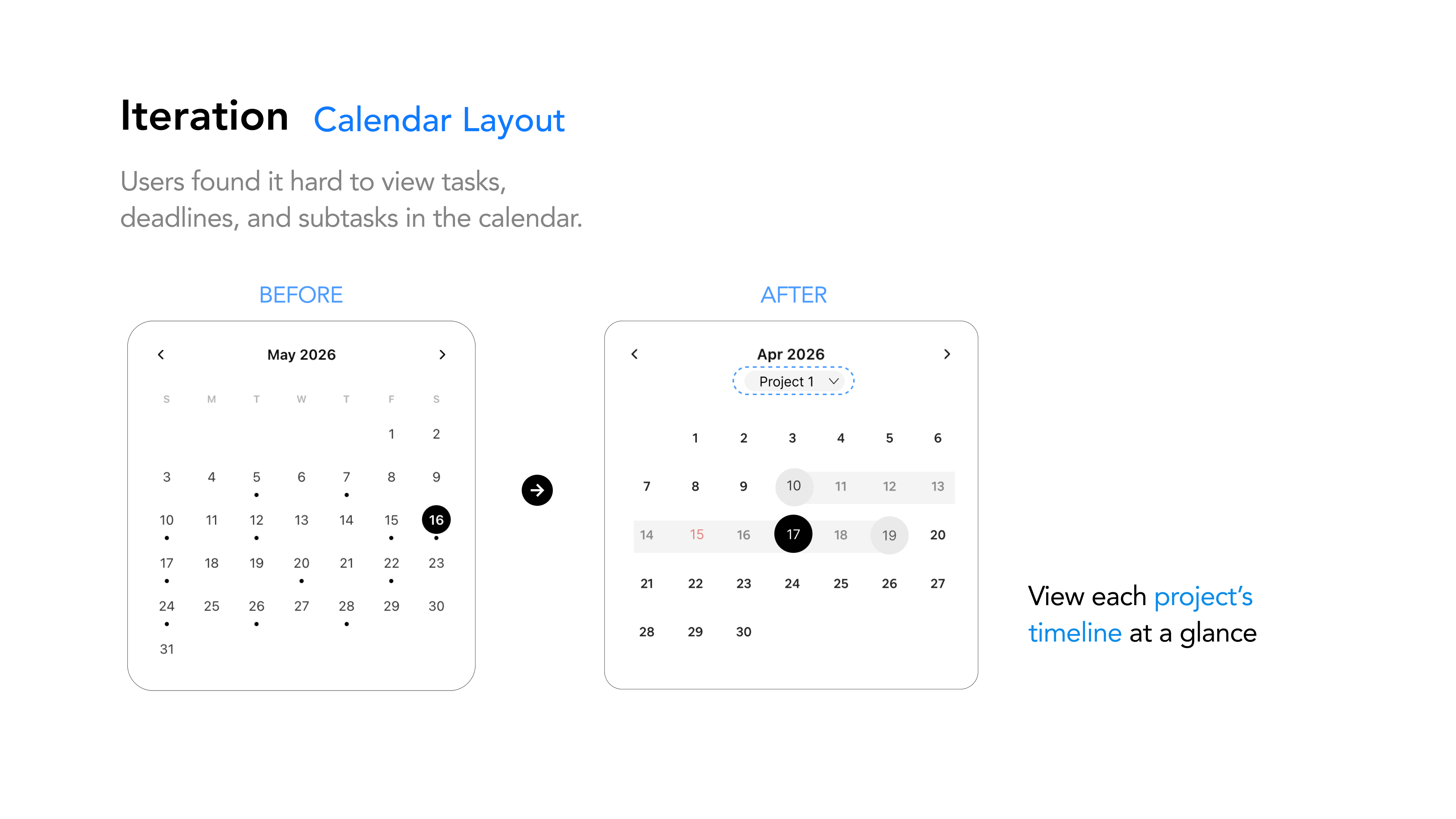
Tasks, deadlines, and subtasks were difficult to understand together in the calendar.
Added a project filter and visible date range so students can read each project’s timeline at a glance.
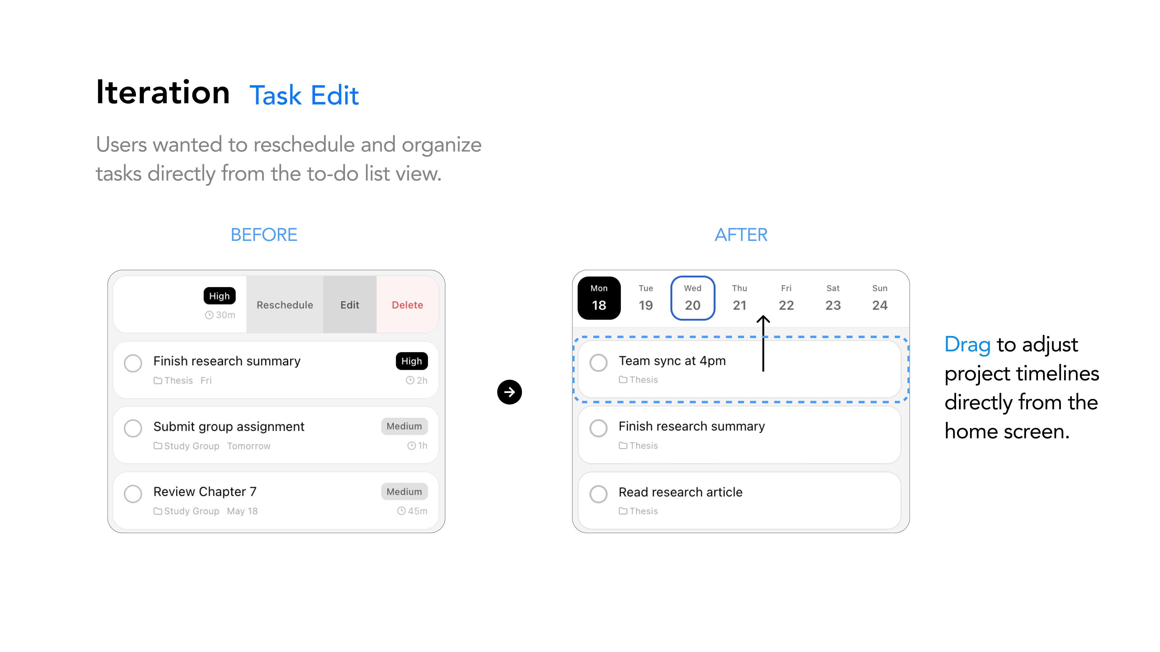
Changing a task date required opening task controls from the list.
Enabled direct drag-and-drop from the home screen, so students can move work to a new day in one action.
Testing #02
After refining the interactions, we tested the experience again to understand whether students could move through the same tasks more easily.
These prototype sessions assessed usability. They do not establish long-term adoption or retention.
The final mobile and desktop experience brings together quick capture, project planning, and everyday progress.
Students moved between paper, calendars, notes, and memory. The longer the setup, the more likely a task was lost.
Support manual, voice, and photo input across the mobile app, widget, and desktop shortcut.
A user can capture first and organize later, without committing to one planning habit.
Students wanted to reschedule directly from the to-do view when a plan changed.
I proposed drag-and-drop rescheduling from Today, so students could move unfinished work directly to another day.
Rescheduling becomes a direct manipulation instead of another form to complete.
Large projects felt vague, oversized, and difficult to begin.
I focused on a review step where users can accept, reject, edit, or add to AI-suggested subtasks before saving.
AI reduces blank-page pressure without deciding the plan for the user.
Tasks, deadlines, and subtasks were difficult to understand together in the calendar.
Keep tasks connected to their projects and let students review the plan one day at a time.
Students can see what comes next without losing the context of the larger project.
Three quick ways to keep tasks close while you work.
Capture a task while you keep working.
Use voice to add a task from the desktop assistant, without stopping to fill out a form.
Bring a paper note into your plan.
Turn a photo of a sticky note into a task that stays in your digital plan.
Keep the satisfaction of paper.
Cross off finished work directly in the desktop widget, with your daily list close at hand.
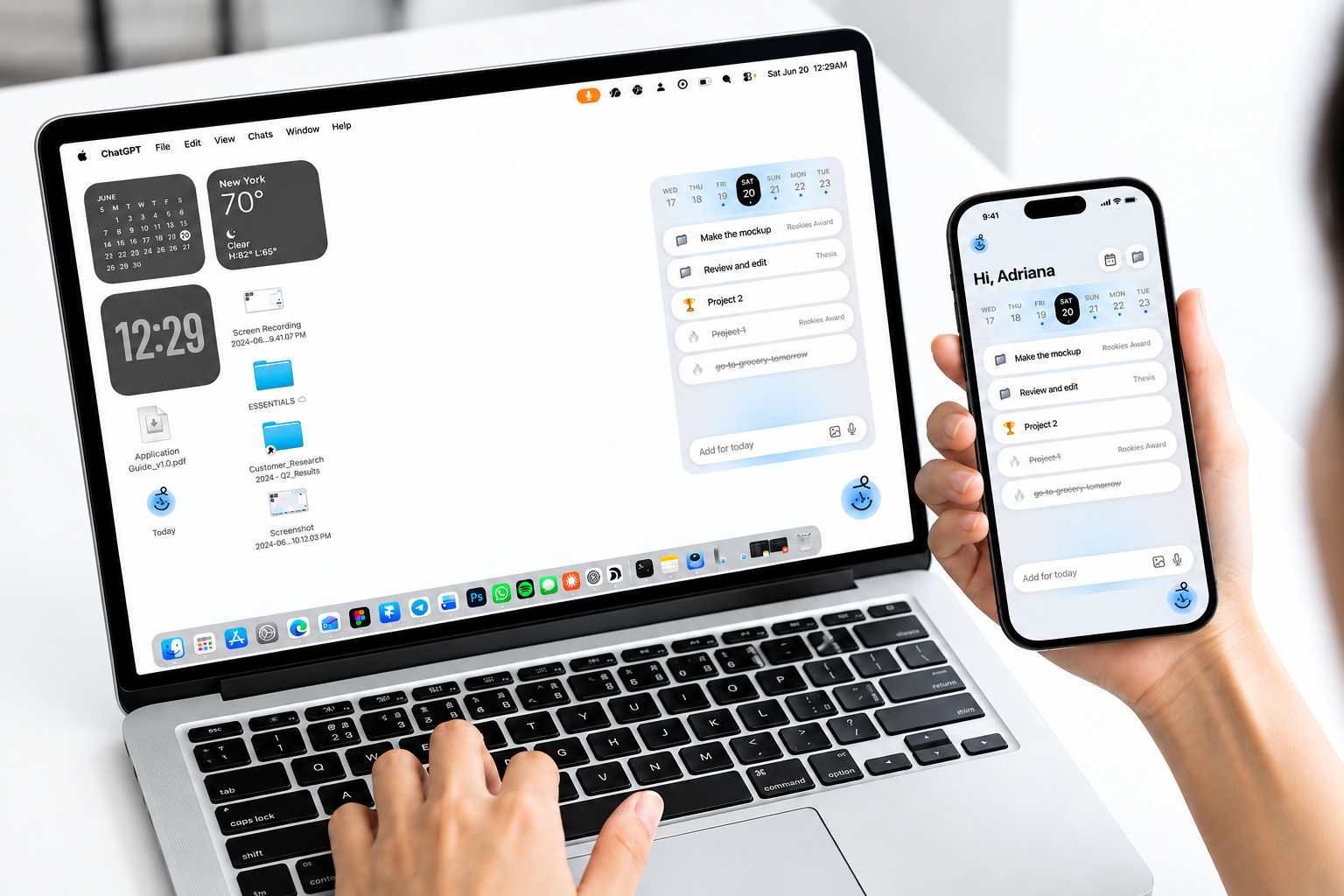
Across the mobile and desktop concepts, 40 students said they would continue using Noty if it became available. This reflects stated interest, rather than measured daily use or retention.
Tasks that once lived in notes, reminders, and memory now have a place to be captured and reviewed.
Large assignments become editable, actionable steps so students can focus on what comes next.
Visible completion feedback brings back the small reward of crossing something off on paper.
A focused daily view and easy rescheduling help students move forward when plans change.
Live mobile experience
Explore how Noty helps you capture a task, break down a project, and adjust your day.
Open Noty (opens in a new tab)
I translated research findings into concrete interactions: quick task capture, project breakdown, and drag-to-reschedule. Two rounds of usability testing helped me refine these flows and keep design decisions connected to students’ needs.
We tested how easily students could use the flows, but learned less about their value in everyday life. Forty students expressed interest in continuing to use Noty; we still need to understand whether they would return and use it over time.
AI proposes. The user decides. AI can offer a starting point, while users review, edit, and confirm its suggestions. I would compare the effort of reviewing and correcting AI suggestions with planning manually to see whether AI actually makes the work easier.
I would test the core flow in students’ everyday routines earlier, observing when they use it, when they stop, and how they respond when plans change. Those findings would guide which features to keep, simplify, or remove.