Rainbow Sheet
I compared recorded behaviors across participants to identify recurring patterns and differences between sessions.

Usability testing research · Product discovery


Project Overview
This academic usability testing research project explored how to improve the experience of finding a suitable secondhand item on thredUP. We observed how shoppers searched, filtered, and evaluated products against specific needs, using Depop as a comparison. Moderated usability sessions and two Maze prototype test rounds helped us identify friction, analyze user patterns, and develop research-informed recommendations. Filter discovery and size understanding emerged as key areas for further exploration.

I analyzed behavior across sessions to connect individual observations with recurring patterns.
I compared recorded behaviors across participants to identify recurring patterns and differences between sessions.
I grouped related observations into themes, then worked with my teammates to interpret the findings and prioritize what to test next.
I also moderated approximately one-third of the usability sessions and built and iterated the Maze prototype. Synthesis, prioritization, and final recommendations were shared team work.
See how observations became patterns ↓01 / Study framing
Our review of thredUP and Depop helped frame the user tests: where do shoppers hesitate while finding a suitable item?
We reviewed four workflows, then focused testing on product discovery and the steps toward purchase.

Shared interest in affordable, sustainable fashion.
Curated resale
Peer-to-peer marketplace
Standardized product information
Seller-generated listings
Fixed prices
Offers & negotiation
Platform-level trust
Seller profiles & social signals
RESEARCH VALUECompare how different interfaces support the same shopping tasks—and where uncertainty appears.
Four workflows reviewed across both platforms
Cart → Checkout
Cart page · Item list
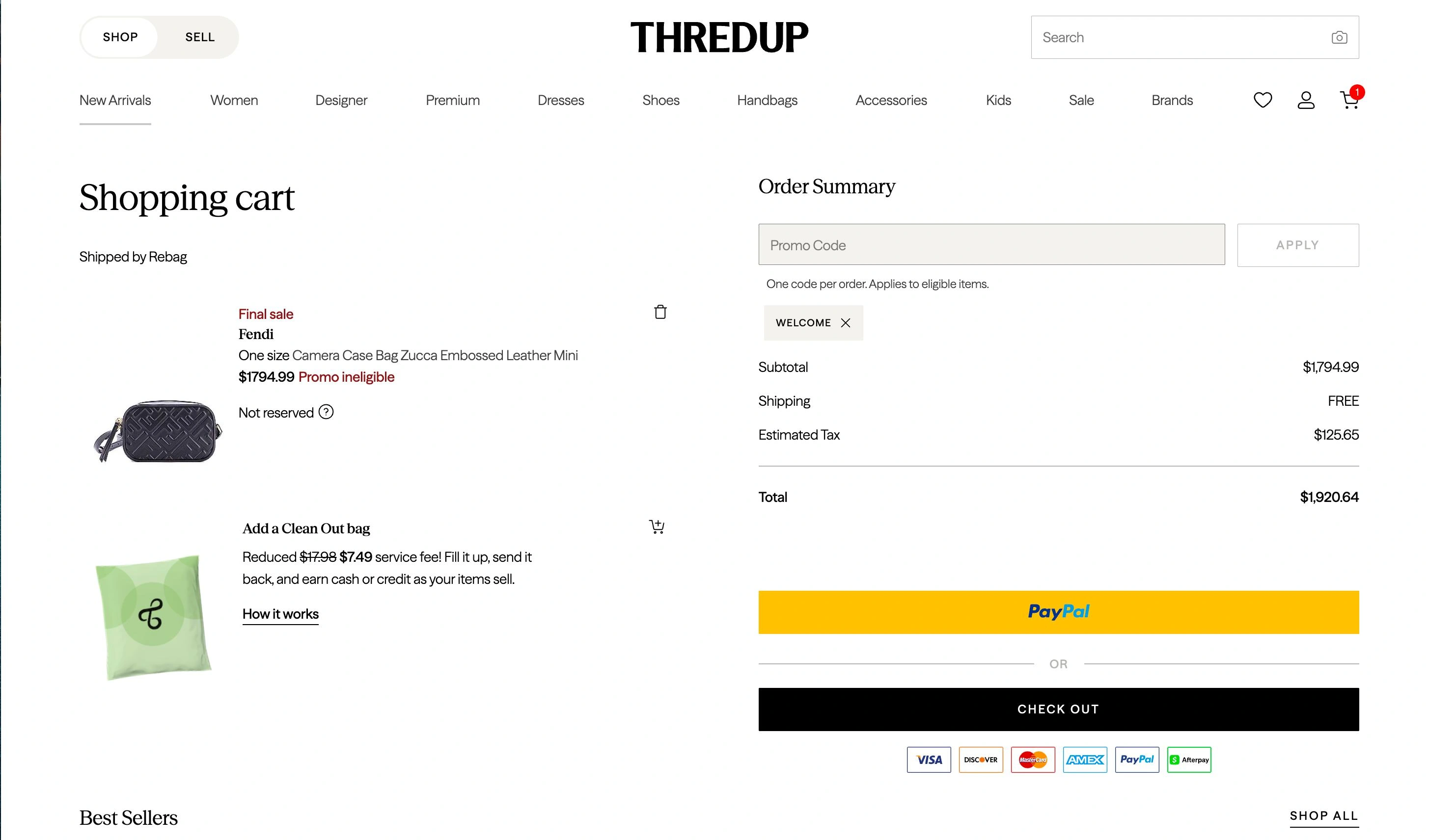
1Optional bag resembles a cart item.
Shopping bag · Order summary
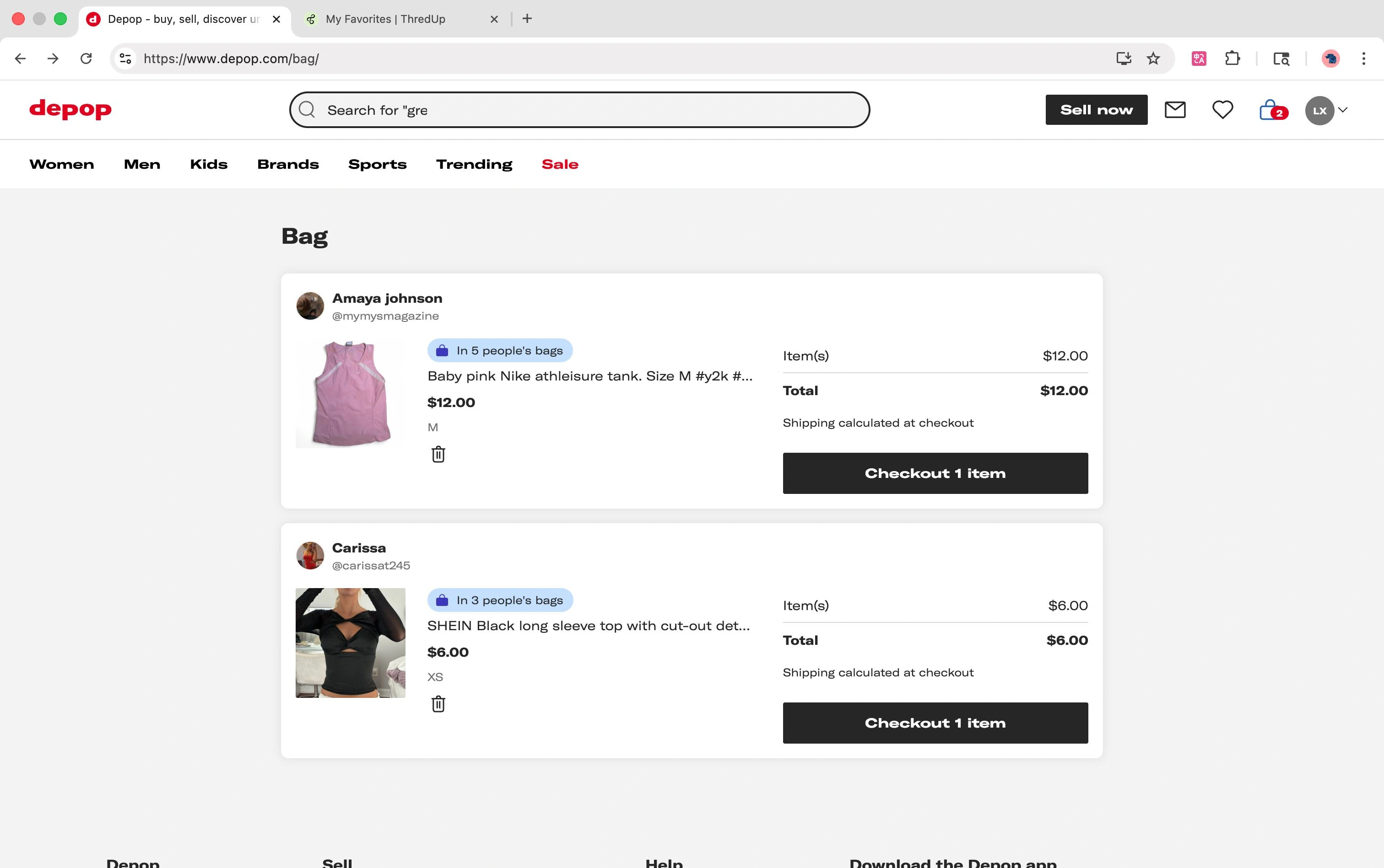
2Total excludes the unknown shipping cost.
Search → Filter → Item
Search results · Filter sidebar
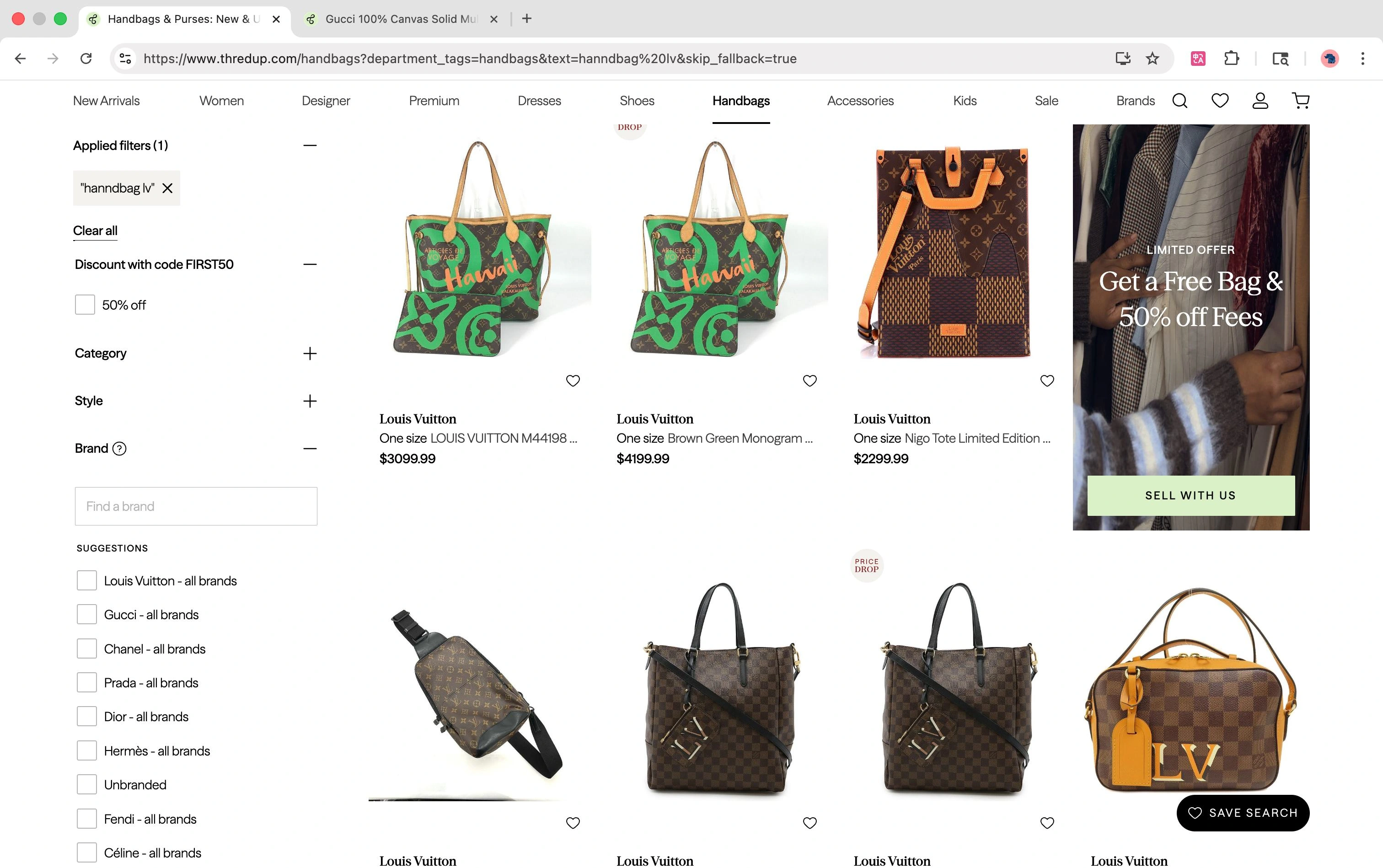
3“handbag lv” appears as a text filter.
4Louis Vuitton is still unchecked.
Product page · Image gallery
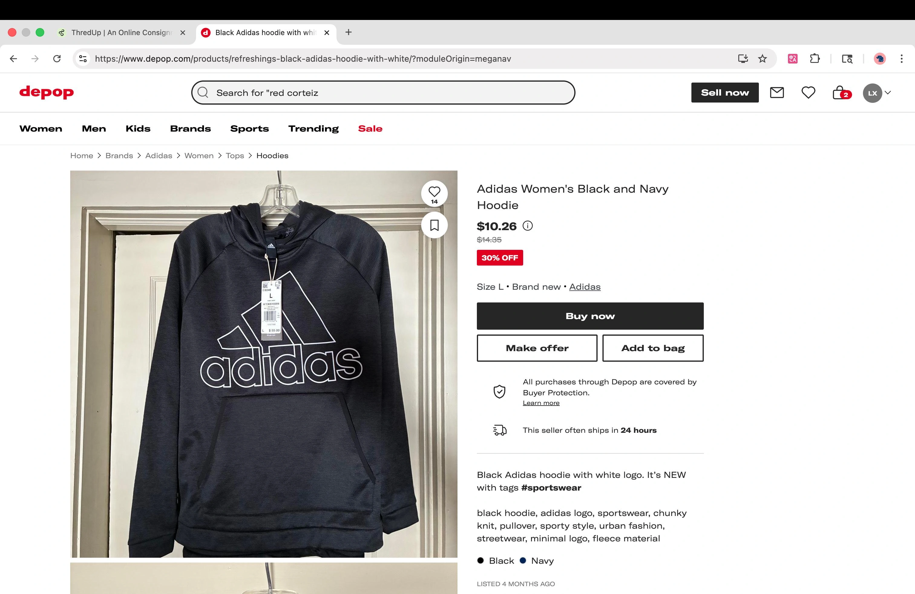
6Seller photos provide limited close-up evidence.
Search overlay · Category tabs
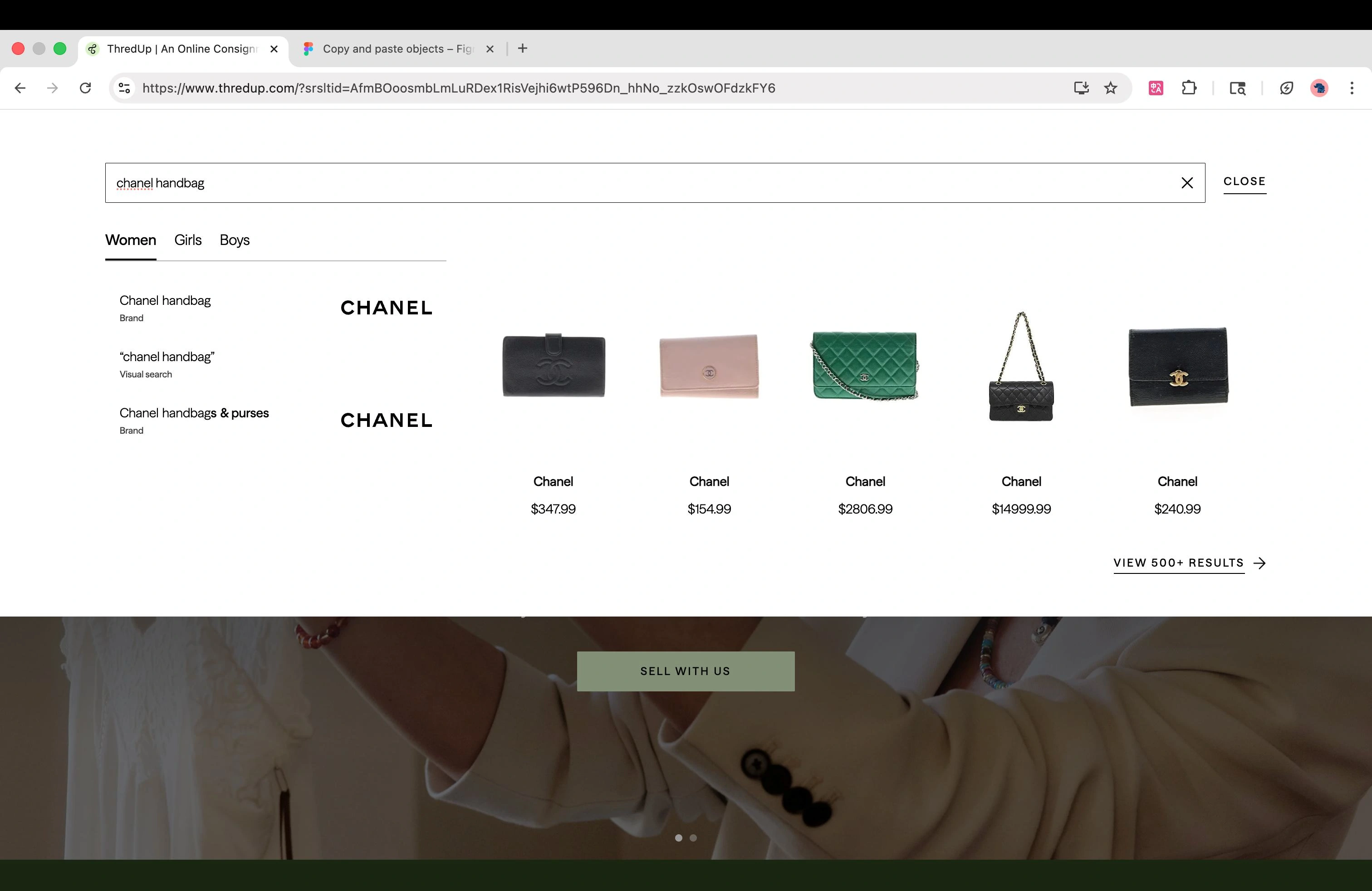
5Switching tabs did not clearly signal updated results.
Uncertainty about the order.
Uncertainty across search, filtering, and item evaluation.

Our review covered discovery and purchase. Testing focused first on:
We expected lower cognitive effort and greater confidence in continuing toward a purchase.
Understand the paths people take, the information they trust, and the moments that interrupt a purchase decision.
We recruited people with recent online secondhand shopping experience to compare the interfaces against familiar shopping habits.
Prior use of thredUP or Depop was not required.
The same shopping tasks on two existing websites.
+Hear what shoppers expect before they click.
Capture routes, hesitation, re-checks, and abandonment.
Ask what made the item feel suitable—or uncertain.
Find a secondhand jacket for an upcoming presentation, then repeat using a different discovery method.
Observe where shoppers begin and how they narrow the results.
Observe how shoppers change approach and compare options.
I used the Rainbow Sheet to compare behavior across participants, then Affinitization to organize related observations into themes.
Where shoppers started, which controls they missed, and what they checked before deciding.
Look for repeated behavior while keeping participant-level differences visible.
Connect related observations into themes to discuss with the team and focus the next test.
The report identifies search as the starting point for seven participants and filter hesitation for nine. Together, these patterns directed our attention to what happened after entering a query.
View the reported user patterns ↗Moderated study · 10 participants · Existing websites
When applying filters on thredUP.
Photographs helped them judge product quality.
Participant groups can overlap.
Three usability issues observed on the existing thredUP website.
Shoppers expected men’s clothing in a catalog organized around Women, Girls, and Boys.

During the project, we learned that thredUP had previously sold men’s clothing before narrowing its focus to women and children. We therefore framed Kids as a clearer signal of the available category, rather than a proposal to expand inventory.
The study does not establish whether participants’ expectations came from prior experience with the platform.
The task specified Size M; numeric labels required shoppers to interpret a different size format.

Shoppers scrolled through products before locating the size filter.

Study boundary: the tasks specified Size M, so the findings concern that conversion task. Inventory gaps also affected completion; they should be distinguished from interface friction.
We prioritized the moments that interrupted the shopping task: finding filters and interpreting sizes.
7/10 started with search
4/10 initially missed size
PROTOTYPE FOCUS6/10 hesitated with size filters
PROTOTYPE FOCUSCondition detail remained a recommendation
Finding filters and interpreting sizes interrupted the task, so I focused the Maze prototype on those moments.
In our shared prioritization, I focused on where shoppers could no longer move forward confidently: locating the filters and interpreting sizes. I translated those priorities into the Maze prototype.
We explored the controls directly involved in the task. Richer product photography remained a recommendation, outside the isolated prototype evaluation.
Participants skipped the guide or clicked its examples, so we tested simpler choices and clearer guidance in the next round.
I built and iterated the Maze prototype. When participants skipped the guide or tried to click its size examples, I used those findings to revise the guidance and size-selection experience with the team.
The next round explored simpler size choices and clearer explanations. My focus shifted from providing more instructions to making the choice easier to understand.
The matrix records the team’s qualitative assessment. Effort was a research-team estimate, not an engineering estimate.
06 / Unmoderated study
Two rounds of testing, with a revision between them.
Test the initial prototype in Maze.
Review behavior and participant feedback.
Adjust the filters and size guidance.
Revisit size selection and guidance.
07 / Unmoderated prototype test
Explore filtering and size guidance in a shopping scenario.
Add a matching item to the cart.Stop before payment.
Find and apply the controls.
Identify the right size.
Rate the task and share feedback.
Participants bypassed the introductory popup.
Explore size selection that does not depend on completing the guide.
Participants tried to select the size examples inside the explanation.
Clarify the guide and explore size information at the point of selection.
The jacket task still presented size groups for other product categories.
Reduce irrelevant options and revisit how participants understand the size groups.
09 / Unmoderated prototype test
Evaluate the revised shopping task with six new participants.
Find a matching item and add it to the cart.Stop before payment.

Reduce irrelevant options and show size information within the filter.

Explain size conversions before using the previous filter system.
Onboarding was not used by everyone. Participants who used it preferred a clear explanation.
The study reports that fewer size options were easier to understand. This supports further exploration of simpler selection, without declaring a winning version.
Across both rounds, 10/12 used filters and 9/12 found or applied the size filter. These observations do not isolate the effect of filter placement.
10 / Research synthesis
Skipped guidance and mistaken clicks shifted our attention to what shoppers could understand while making a selection.
The tests informed the next research questions and interface recommendations. They did not establish improvements in speed, accuracy, or conversion.
11 / Research implications
Make filters easier to find, clarify size choices, and communicate the available category scope.
Consolidate Girls and Boys into Kids to make the children’s category explicit within the platform’s focus on women and children.
Context: the project identified a shift away from men’s clothing. Kids clarifies the proposed category scope; its effect on mistaken navigation still needs validation.
We recommend placing the main filters above the product grid so shoppers can find them while browsing.
4/10 moderated participants initially missed the size filter. The prototype rounds did not isolate horizontal placement from other changes.
We recommend grouping Standard Size and Plus Size and showing letter and numeric sizes together.
Interface detail · redrawn for readability
Interface detail · redrawn for readability
6/10 moderated participants hesitated with size filters. The displayed size mappings are prototype examples; brand, category, and regional sizing rules require validation.
Add close-up photography of fabric, wear, and measurements. This recommendation still needs a dedicated evaluation.
Evaluate filter placement, size grouping, and guidance separately. Record discovery, correct selection, task completion, time, and errors in a working flow, including recovery when no items match.
12 / What I learned
Use frequency, task impact, and effort to choose where to start.
I learned to resist redesigning everything at once. Moving from the broad heuristic review to a focused shopping task helped me prioritize the moments that blocked progress. I now use frequency, task impact, and effort to decide what deserves attention first.
Watch for pauses, retries, and missed controls—not just what people say.
Moderating sessions taught me to give behavior more weight: where shoppers paused, retried, or overlooked a control. Across the study, skipped guidance and attempts to click size examples showed why explanations alone were not enough. Comments helped explain the behavior.
Connect every recommendation to an observation, then challenge it in the next test.
Building and revising the Maze prototype helped me connect evaluation with design decisions. I learned to link each recommendation to a specific observation, then use the next test to challenge it. Small prototype studies can guide a direction; stronger performance claims need clearer measures.