
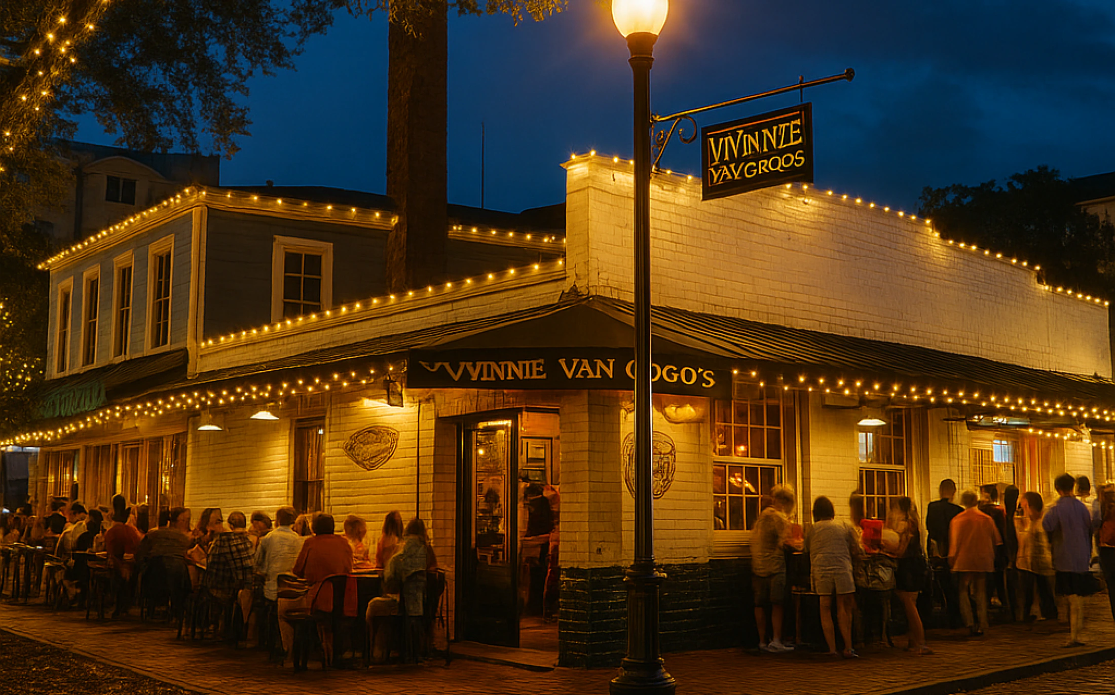
First impressions of the existing website
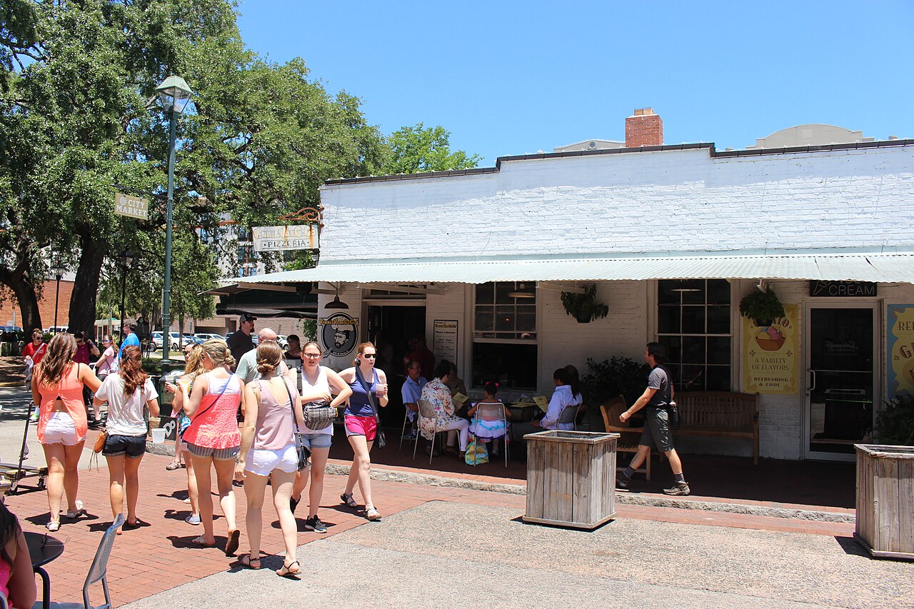
We invited restaurant guests, including local diners and tourists, to look at the existing website and share their impressions. This was an initial website review, focused on what they understood and what left them unsure.
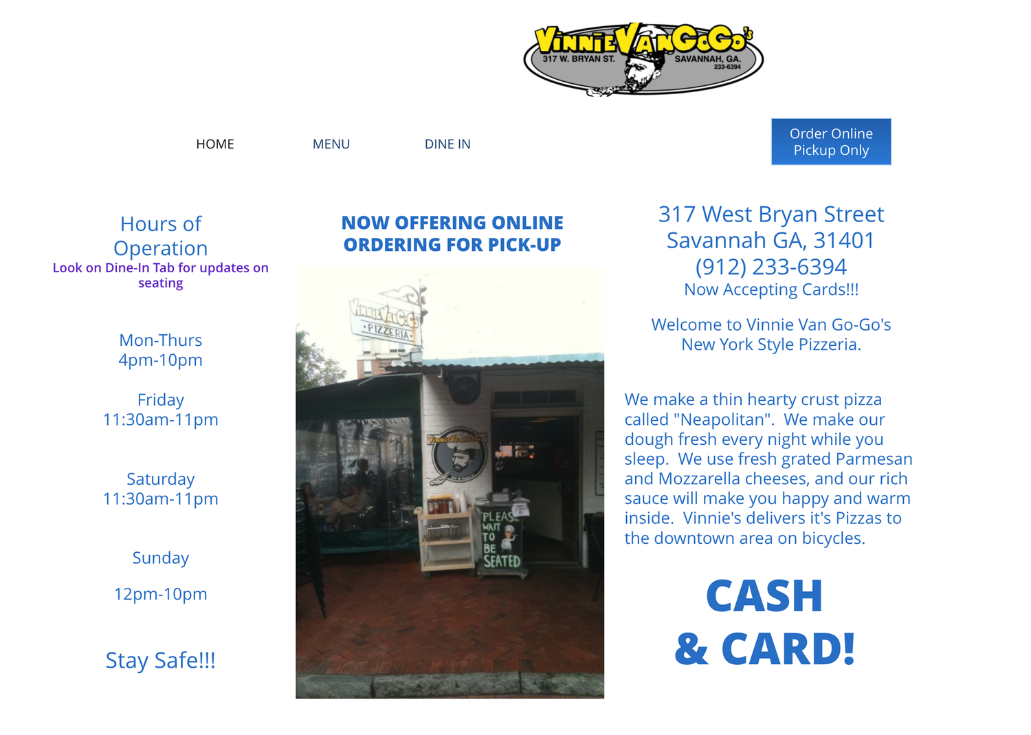
“Couldn’t tell this was a restaurant.”
“Maybe pizza?”
“Didn’t trust the website enough to use it.”
Target User
Our primary website audience
Tourists.
Still discovering.
Still deciding whether to visit.
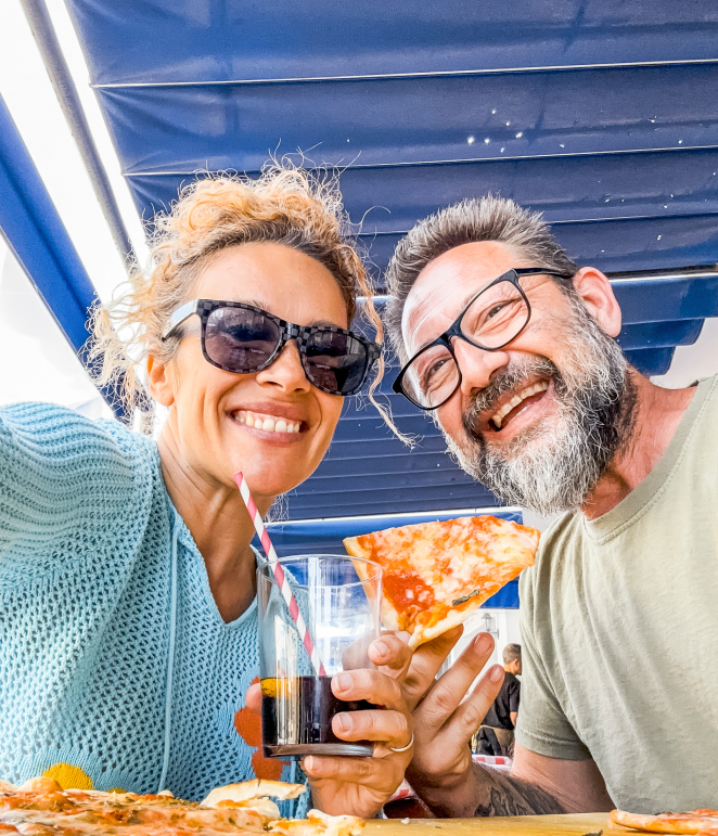
“We looked at their website and thought they hadn’t updated it.”
Tourists needed an introduction to the place. The initial website review showed why that introduction wasn’t working.
Insight
The restaurant had regulars.
The website needed to serve newcomers.
Interview
What do tourists need before a first visit?
01 · TripWhy visit Savannah?
02 · ChoiceHow do you choose a restaurant?
03 · ExpectationsWhat does “historical” mean to you?
Discovery
Food was part
of a bigger trip.
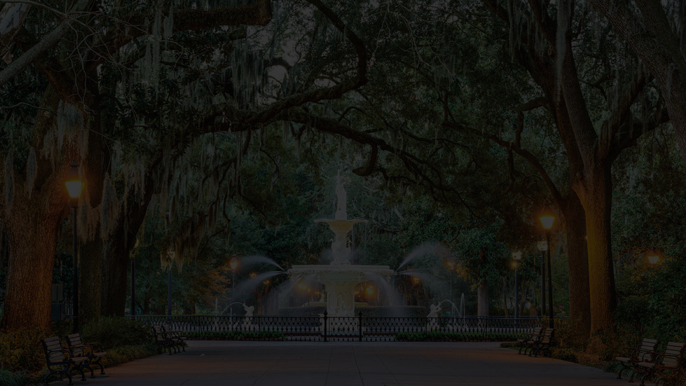
Tourists searched by location and looked for historic places with stories. Restaurant discovery was connected to exploring Savannah.
Led to search language
& Explore Nearby
Local character
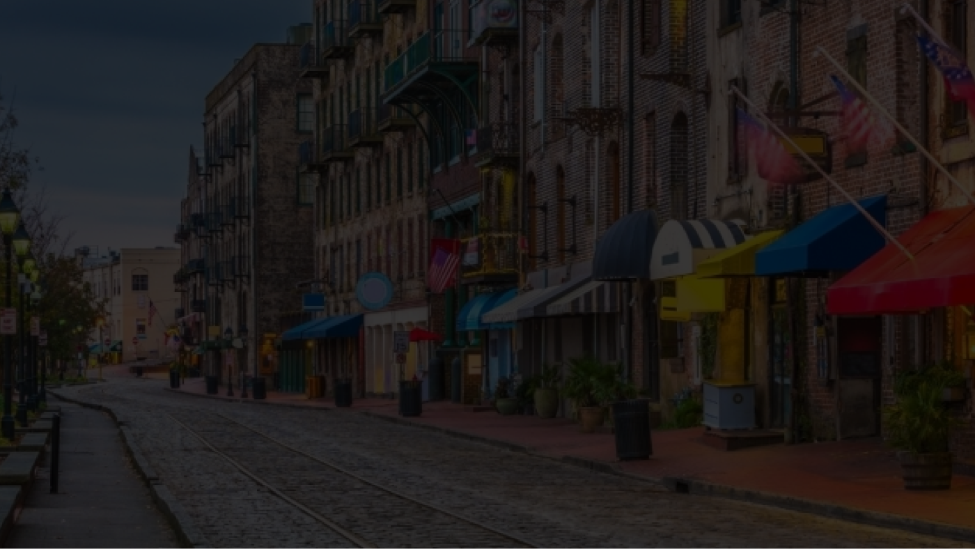
A meal should feel like part of Savannah.
“I imagine old brick streets, iron balconies, and moss hanging from oak trees — everything feels timeless.”
Led to local stories, photography
& a warmer visual atmosphere
How Might We
Help tourists discover Vinnie’s through Savannah’s landmarks, history, and local stories?
Card Sorting
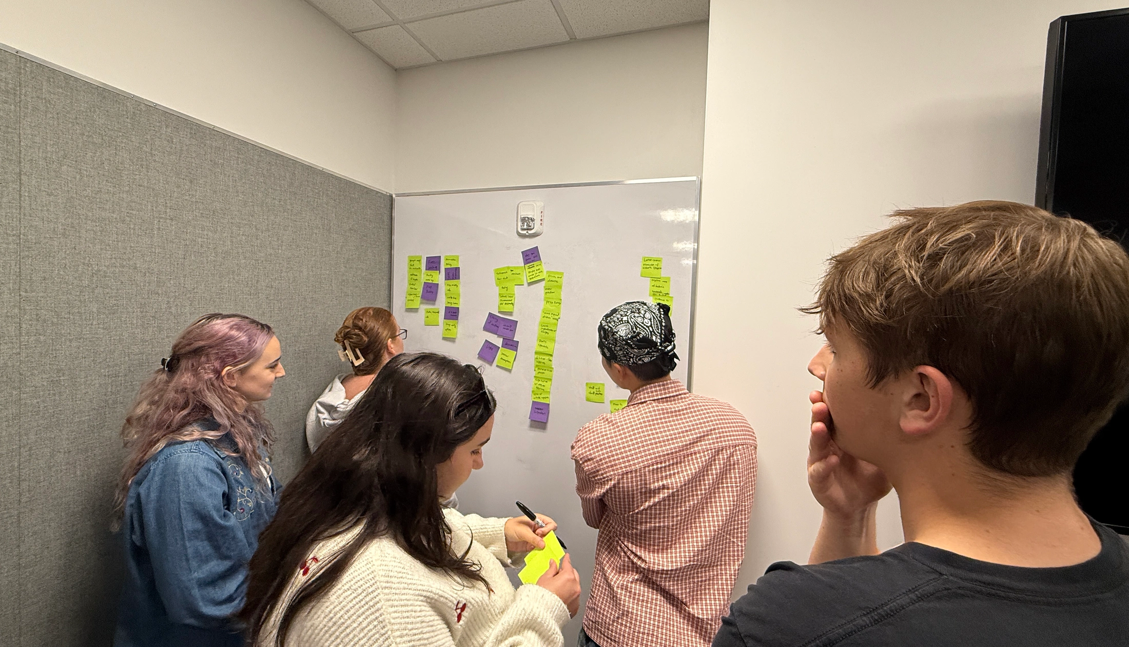
Interviews clarified what tourists needed: food, local stories, nearby places, and practical visit information. We used open card sorting: tourists created their own groups to organize that content.
What belongs together?
Tourists grouped content cards using their own categories. This helped us organize related information into sections they could recognize.
What deserves prominence?
We used the interview and website-review findings to guide emphasis: make the restaurant understandable, communicate its local character, and help visitors plan.
Grouping informed the sitemap.
Research informed what we emphasized.
Information Architecture
Home introduces the restaurant. The remaining branches let visitors go deeper into the food, local character, and plans for a visit. The content groups from card sorting became the sections below.
Home
Homepage
Our Story
- Restaurant Story
- In the News
- Staff & Chef Story
- Restaurant Story
Hear from Our Guests
- What Everyone’s Loving
- Share Your Photos
- Share Good Moments
- Share Feedback
- Rating
- What Everyone’s Loving
Connect to us
- Call to us
- Find Parking Nearby
- Get direction
Explore Nearby
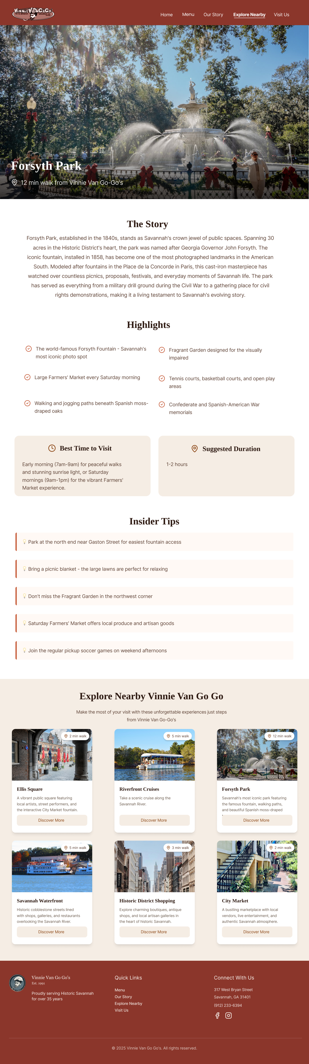
- Ellis Square
- Riverboat Cruise
- Forsyth Park
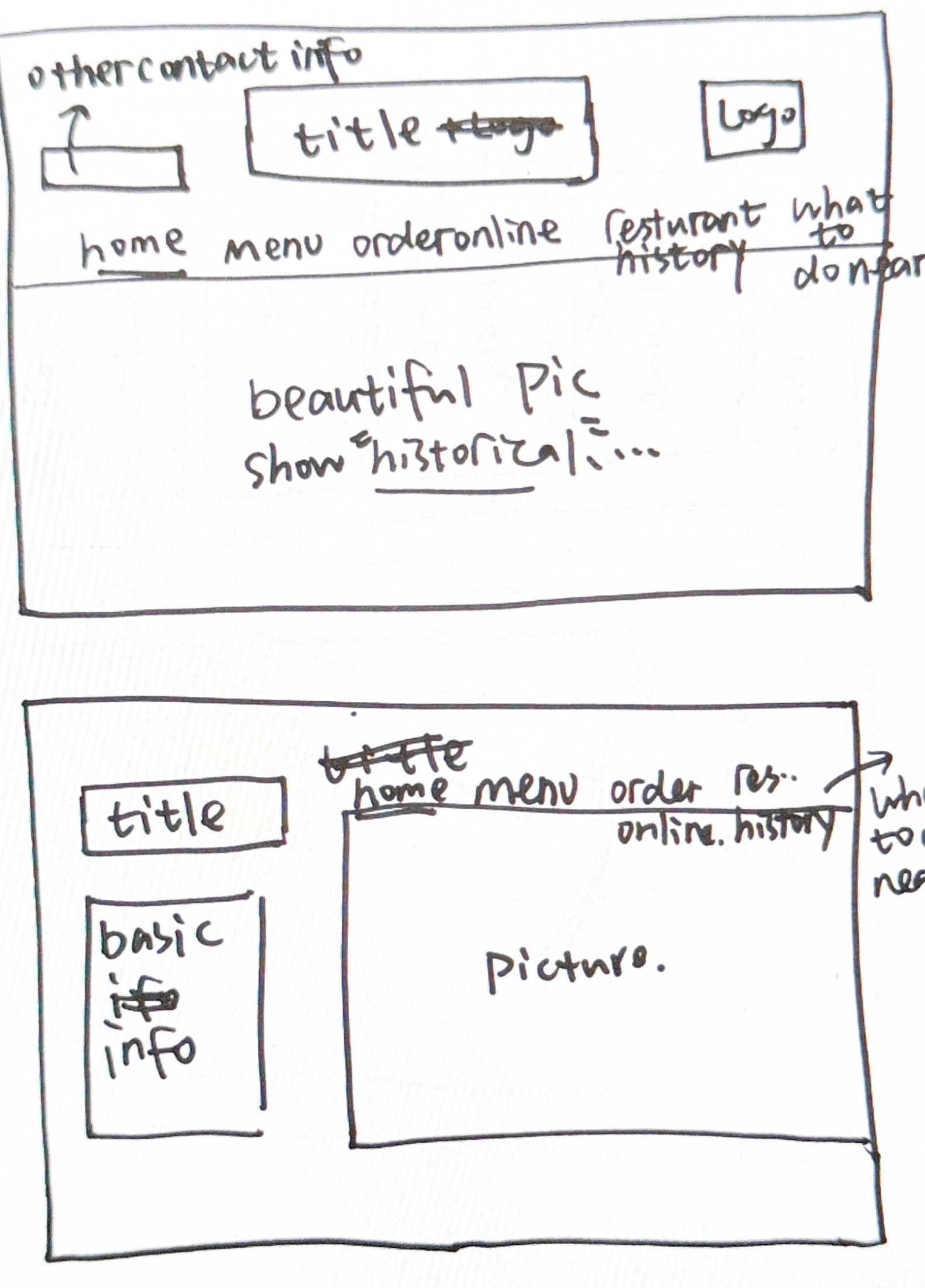
Ideation to Mid-fidelity
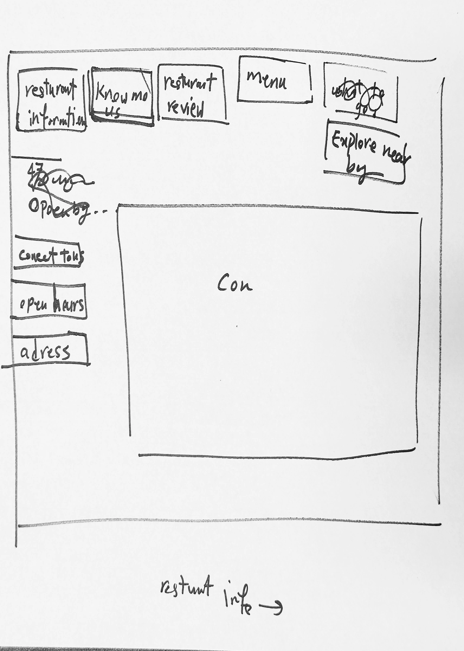
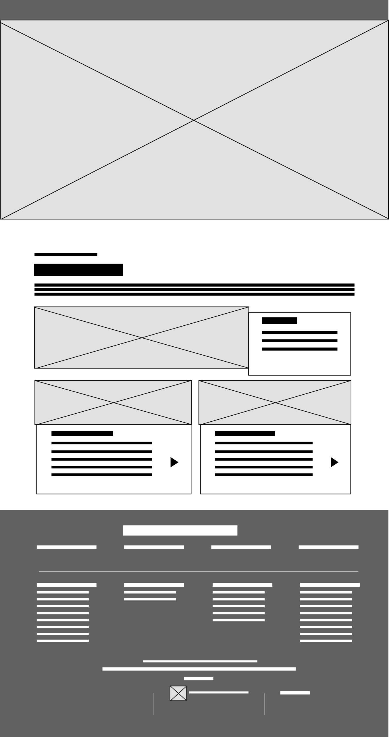
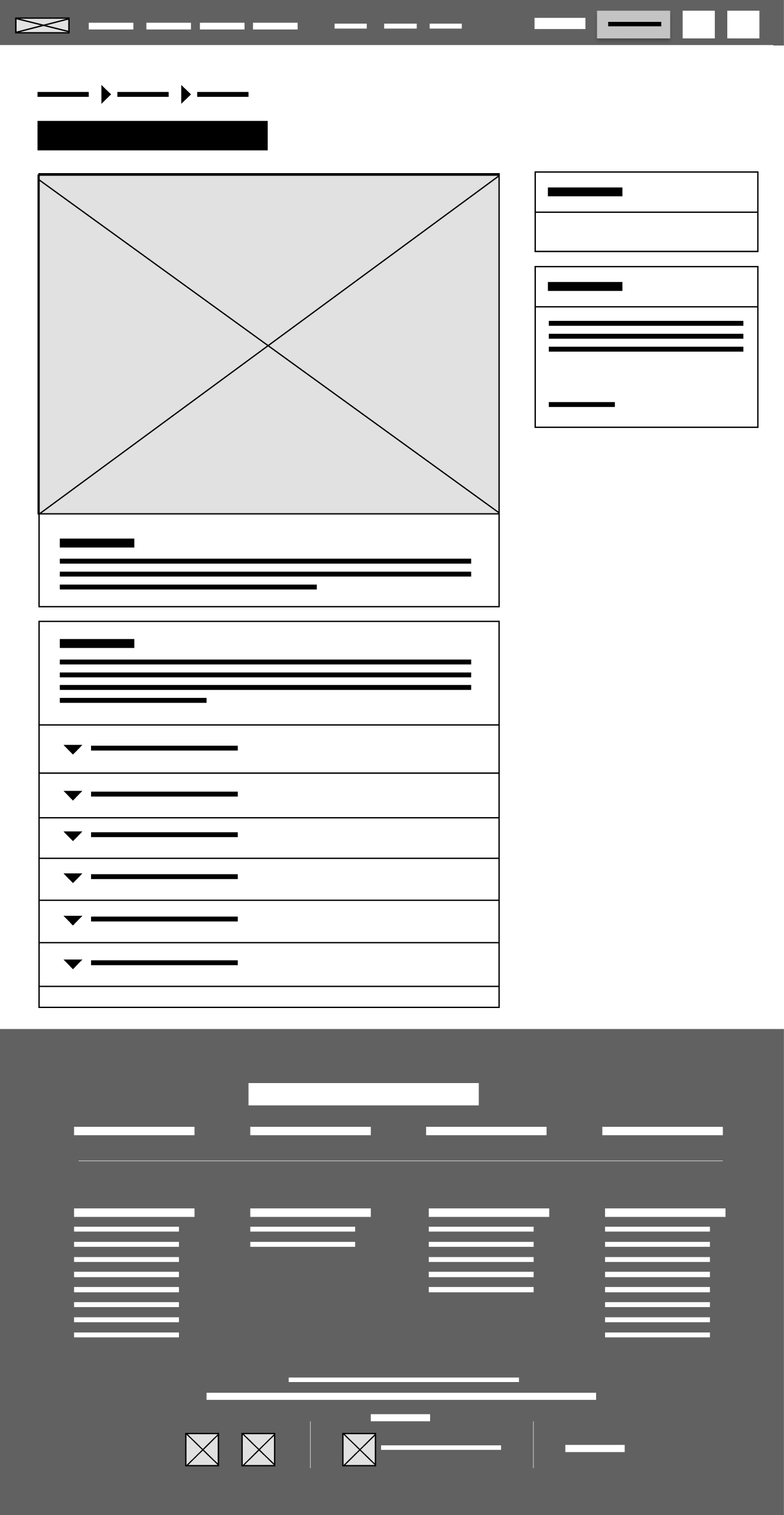
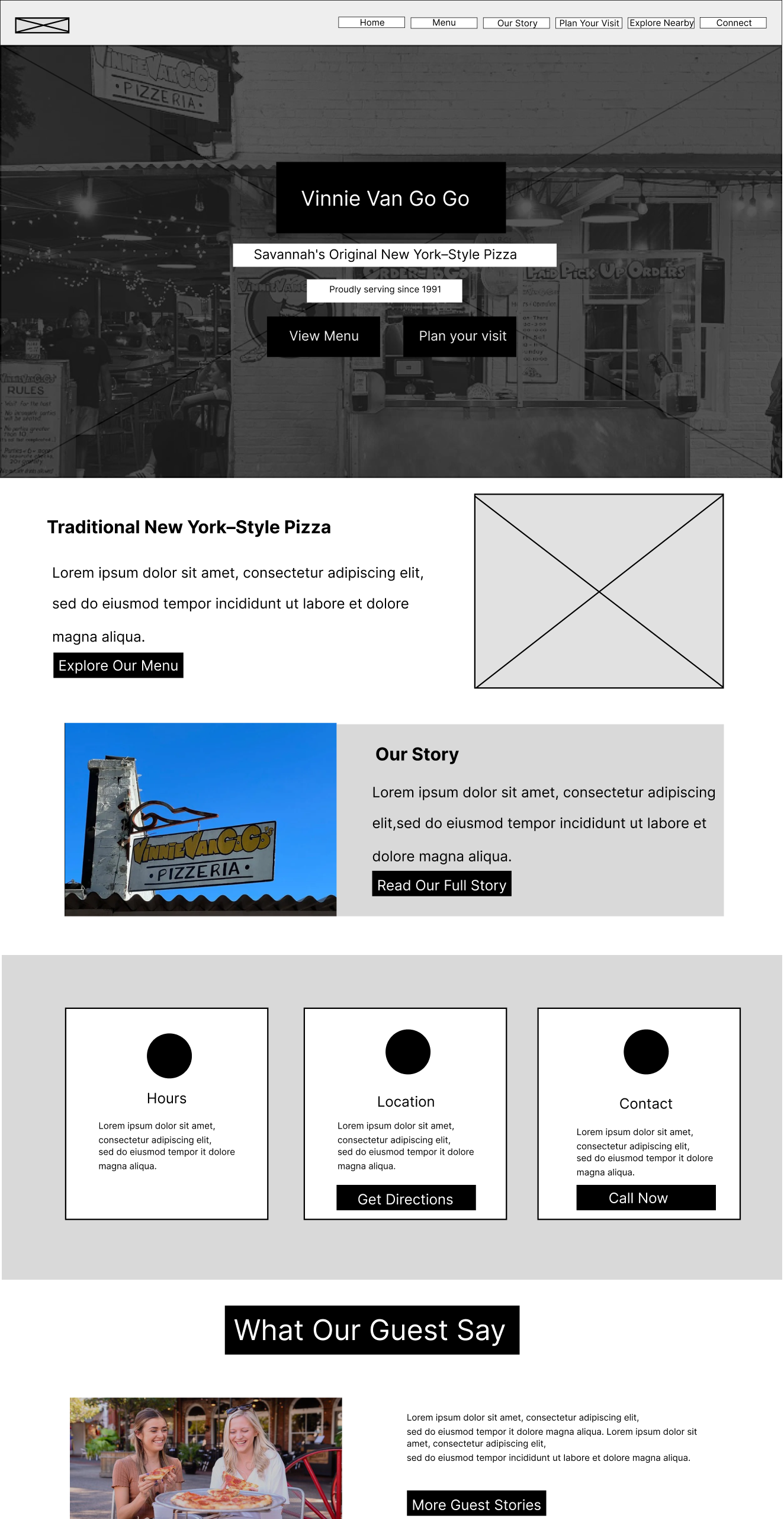
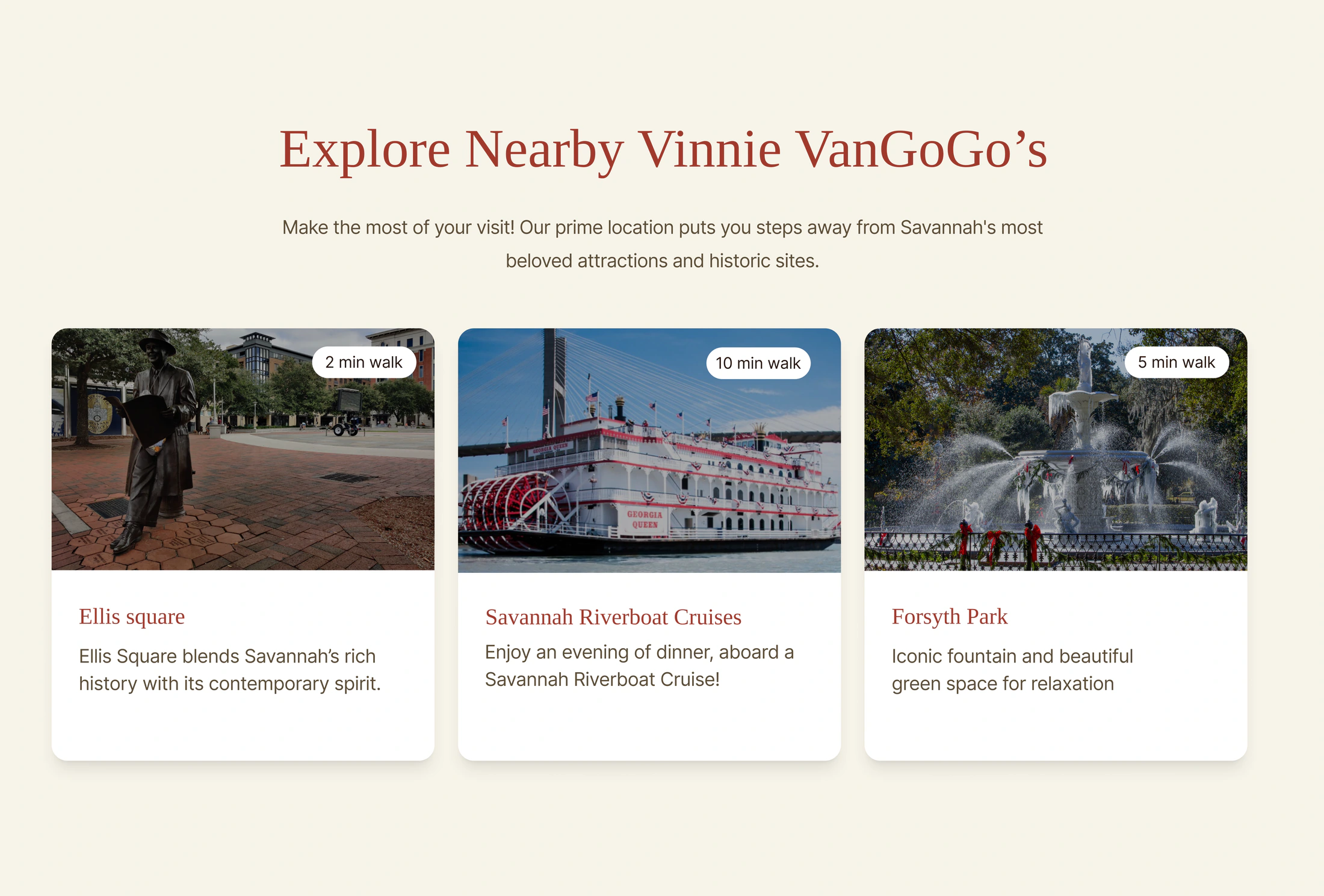
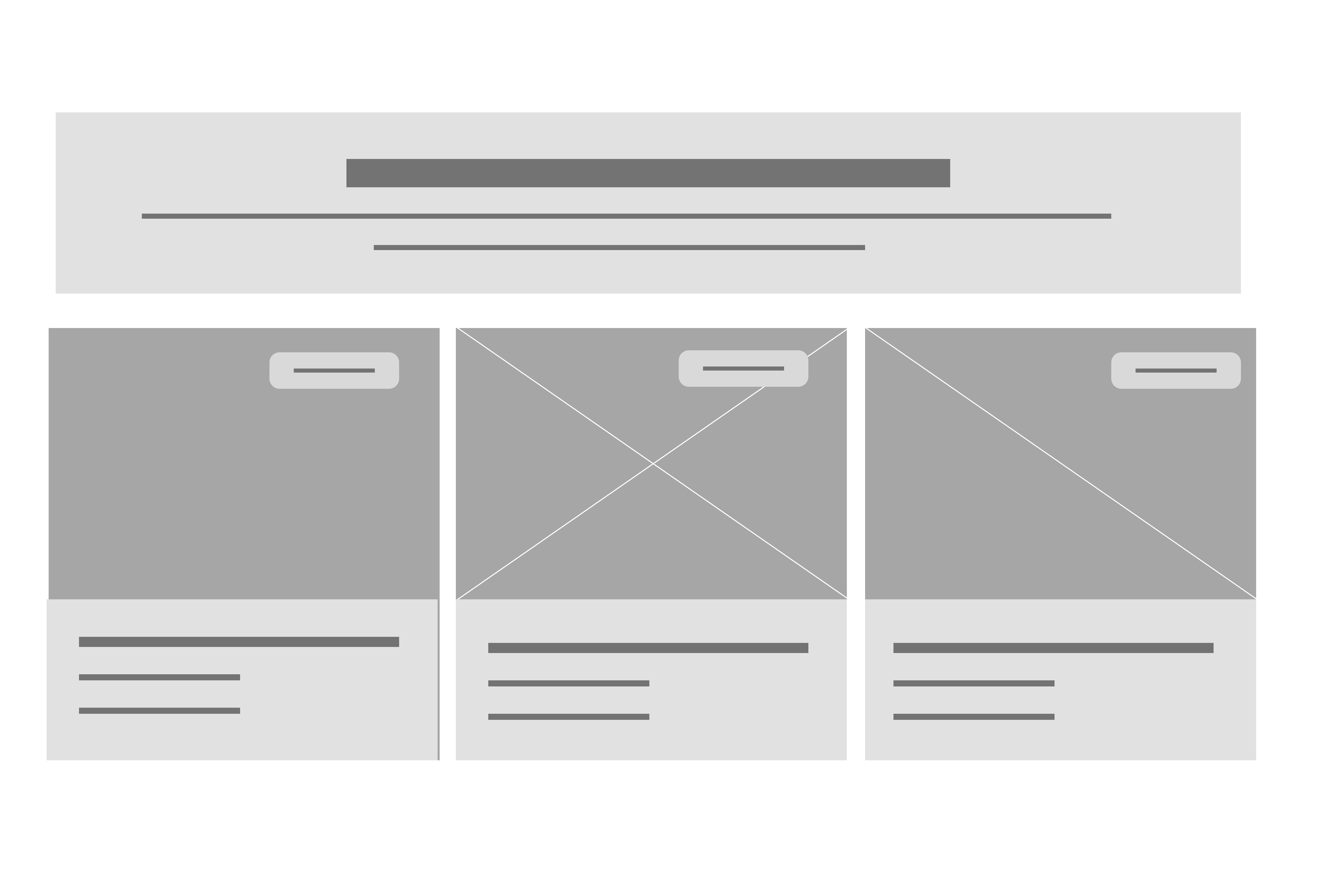
SEO informed our UX writing
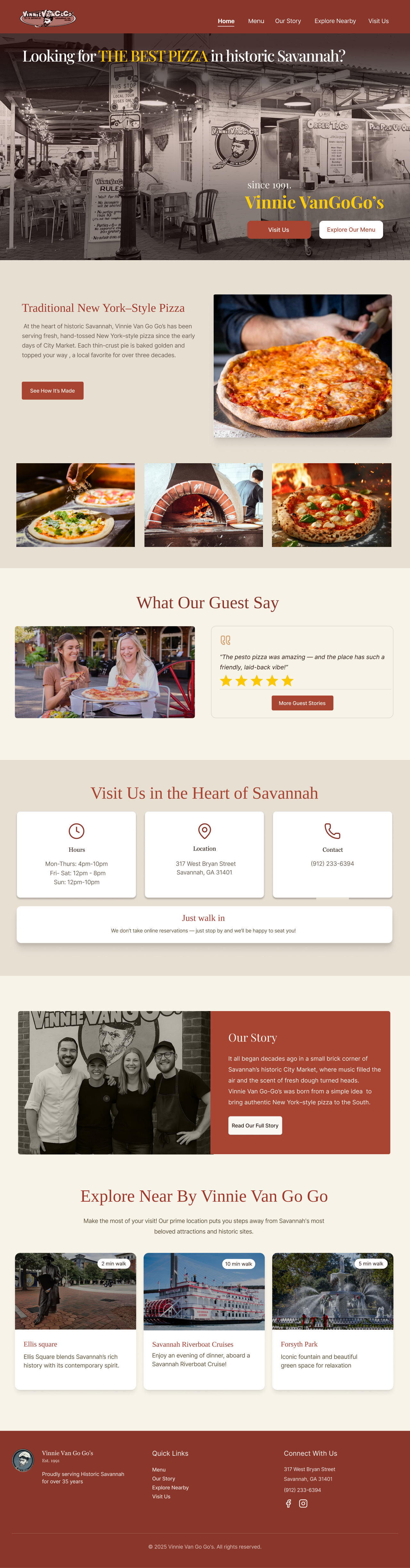
We adapted our headlines, place names, and calls to action to the language tourists use when searching. The aim: create more opportunities for the restaurant to be discovered—and help tourists find a website that answers their needs.
1K–10K searches / month
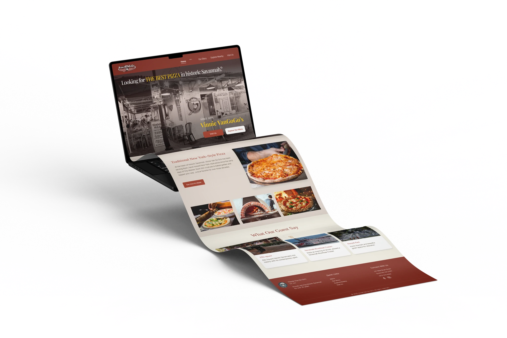
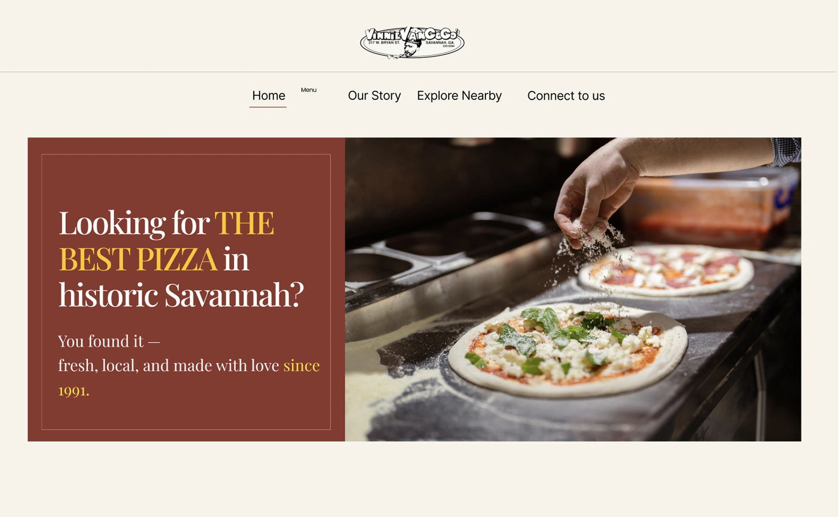
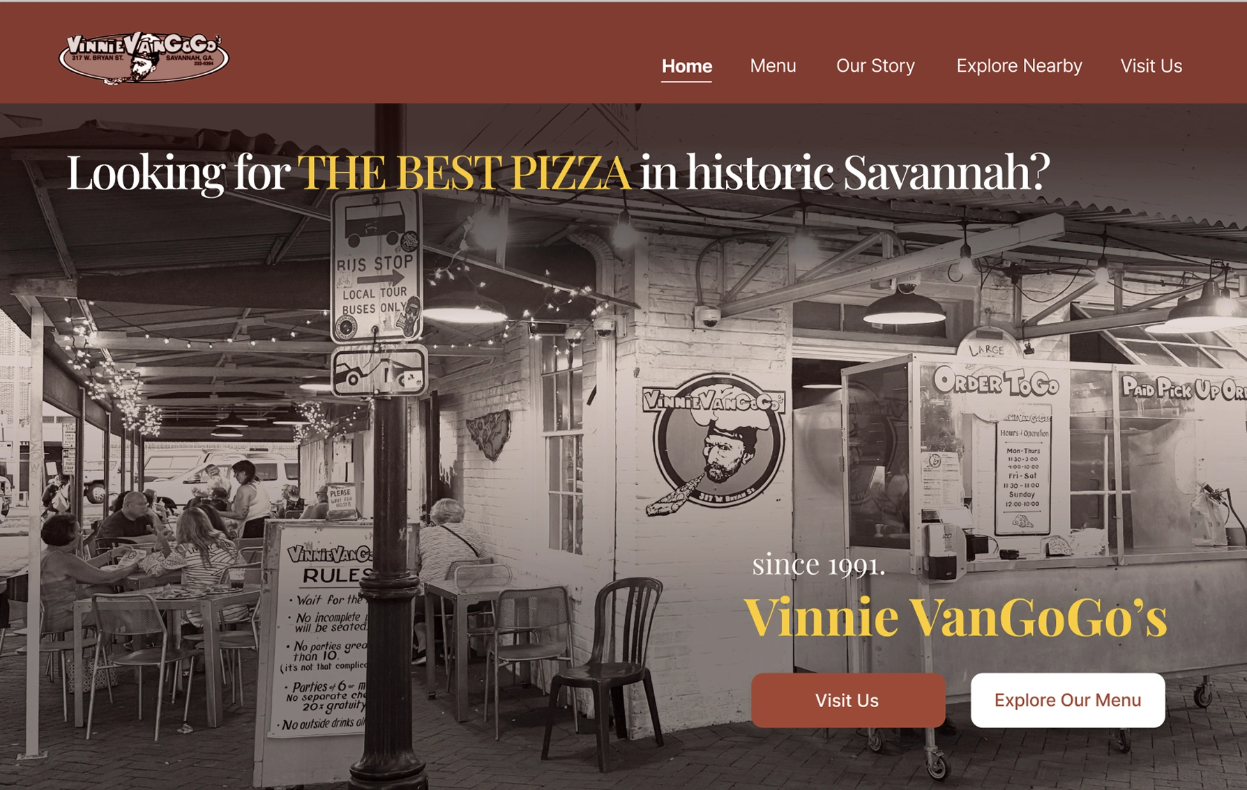
Looking for THE BEST PIZZA in historic Savannah?
Pair the food with the city so tourists immediately know what—and where—we are.
10K–100K searches / month
Make the most of your visit!
Connect a search for things to do with nearby places to explore around the restaurant.
1M–10M searches / month
Visit Us in the Heart of Savannah
Bring hours, the address, and contact details together for tourists planning a visit.
0–10 searches / month
Our Story
Show the restaurant’s roots in Savannah’s historic City Market through its own story.
10K–100K searches / month
Forsyth Park
Use the landmark’s familiar name to connect tourists’ searches with a visit nearby.
Visual Design
Design System
Warm neutrals, Vinnie’s brick red, and expressive typography bring the restaurant’s character to the web.
Testing
We tested the first prototype with 5 tourists across 3 key tasks to understand if the experience matched their needs. The results revealed areas where visitors struggled with navigation, finding key information, and planning their visit.
Iteration
01 · Make the first impression actionable
The split hero separated the message from the restaurant itself. A full-width exterior photograph gives visitors a clearer sense of place; paired menu and visit buttons make the next step explicit. “Visit Us” also replaces the vague “Connect to us” label.
02 · Make the food easier to recognize
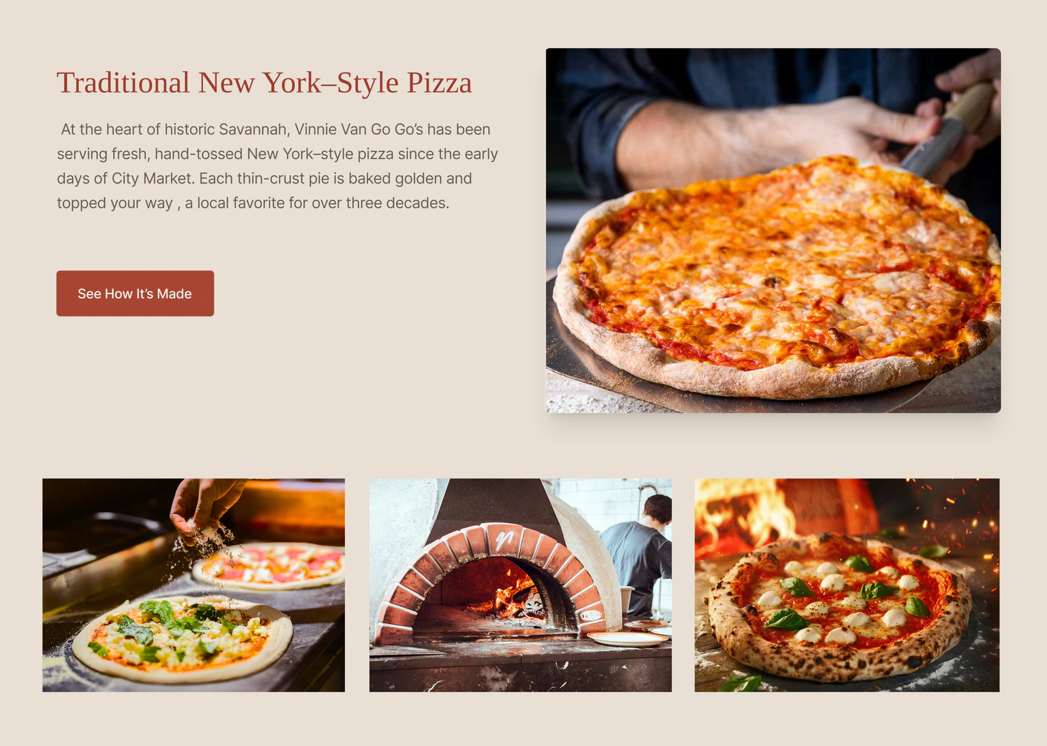
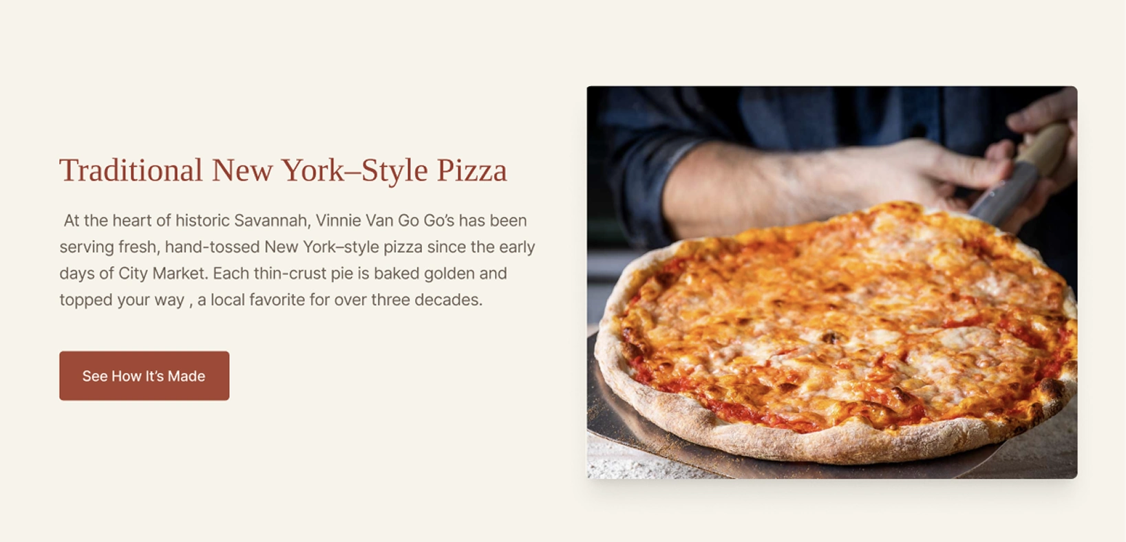
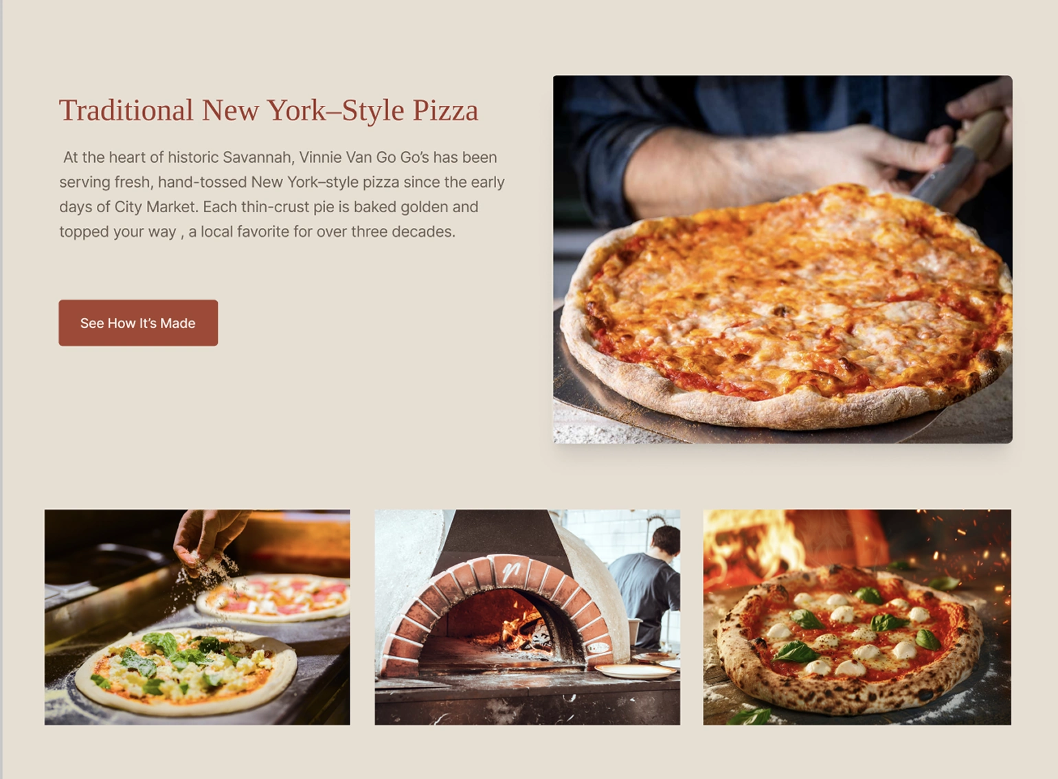
Testing participants asked for more pizza imagery. Adding preparation, oven, and finished-pizza photographs gives the food a stronger presence and shows how it is made, helping visitors understand the offer before opening the menu.
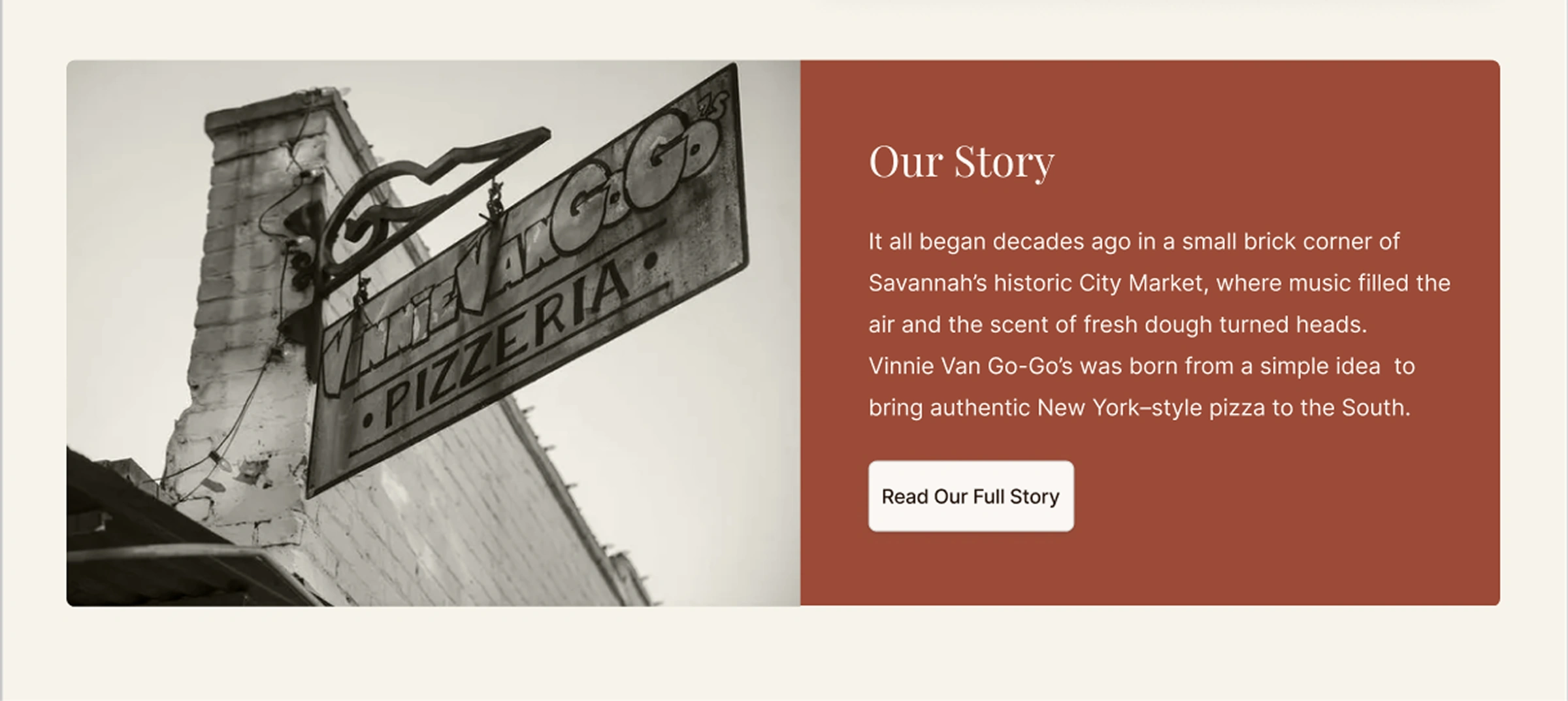
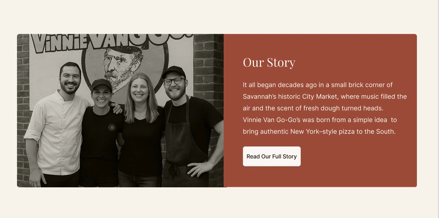
03 · Give the story a human face
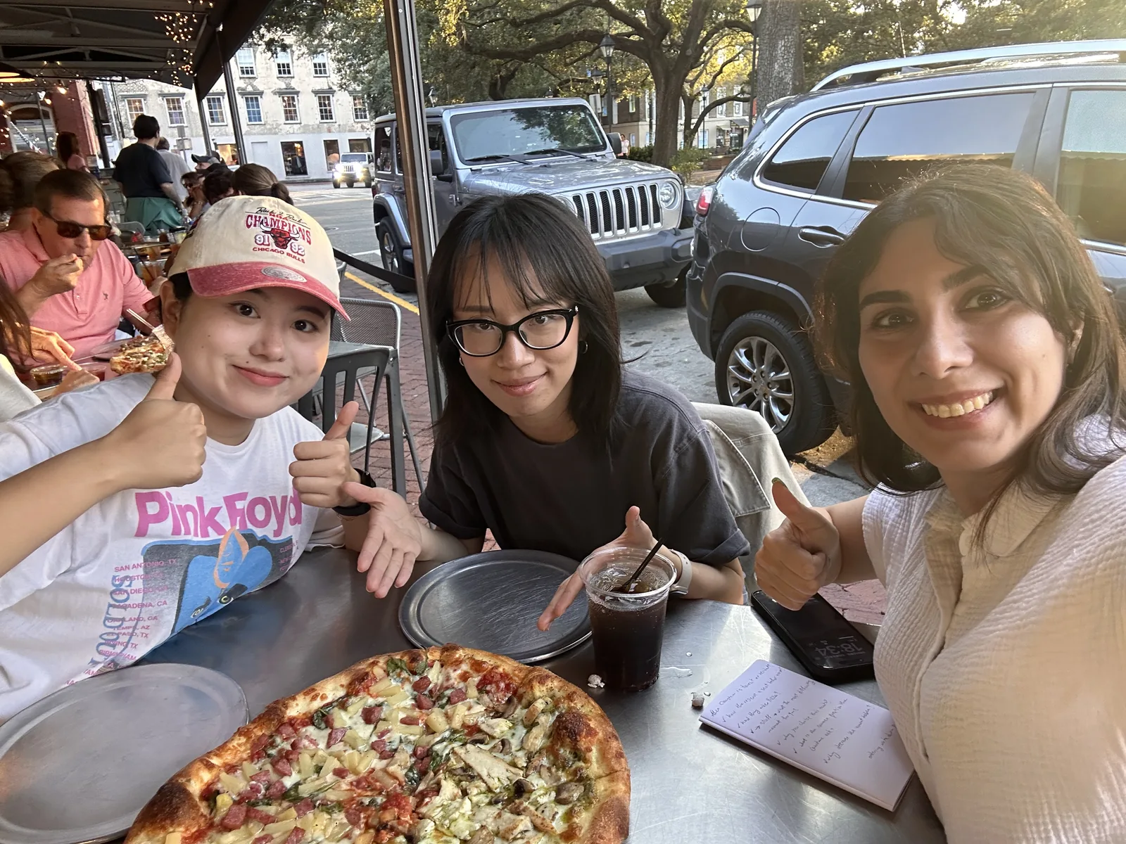
A sign identifies the place, but says little about its people. Replacing it with a group portrait connects the history to real faces and supports a warmer, more personal impression of the restaurant.
Testing 2
After the design revisions, task completion rose from 82% in the first round to 93% in the second round—an increase of 11 percentage points.