Vinnie VanGoGo’s
The oldest pizza restaurant in Savannah
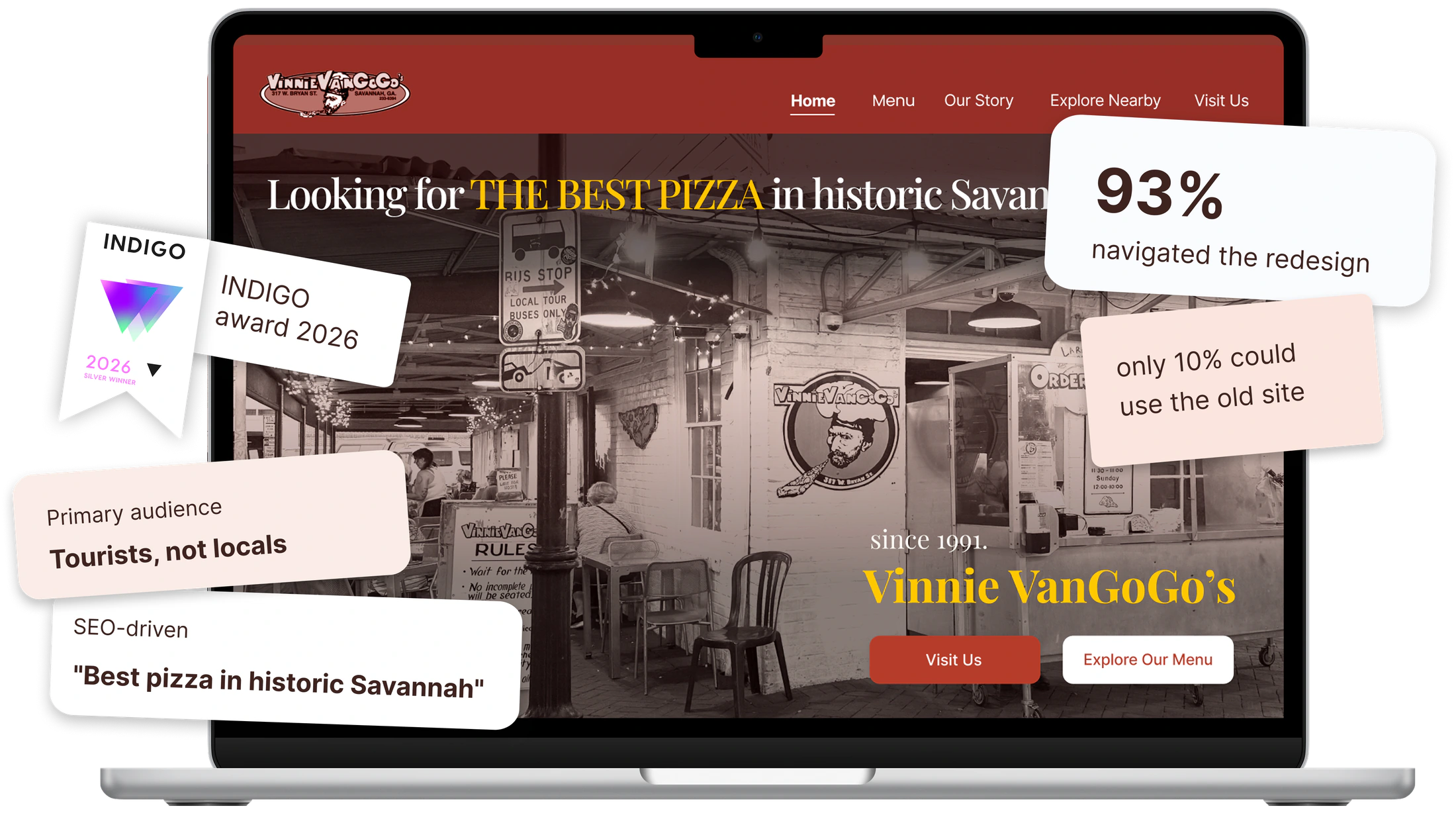
The Wrong Story for a Great Restaurant
Vinnie VanGoGo's was a local landmark, but its digital experience failed to reflect it. Poor information architecture, cluttered content, and limited context made it difficult for tourists to discover what made the restaurant unique.
The Solution
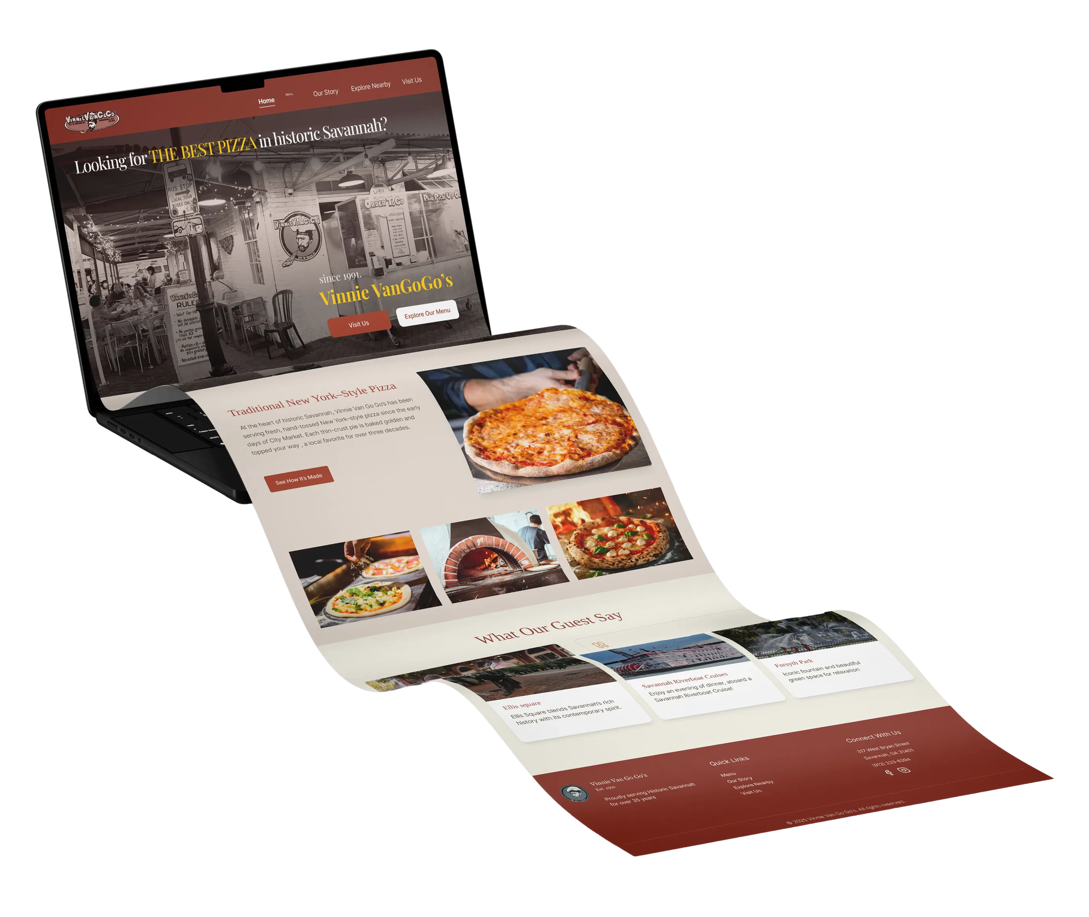
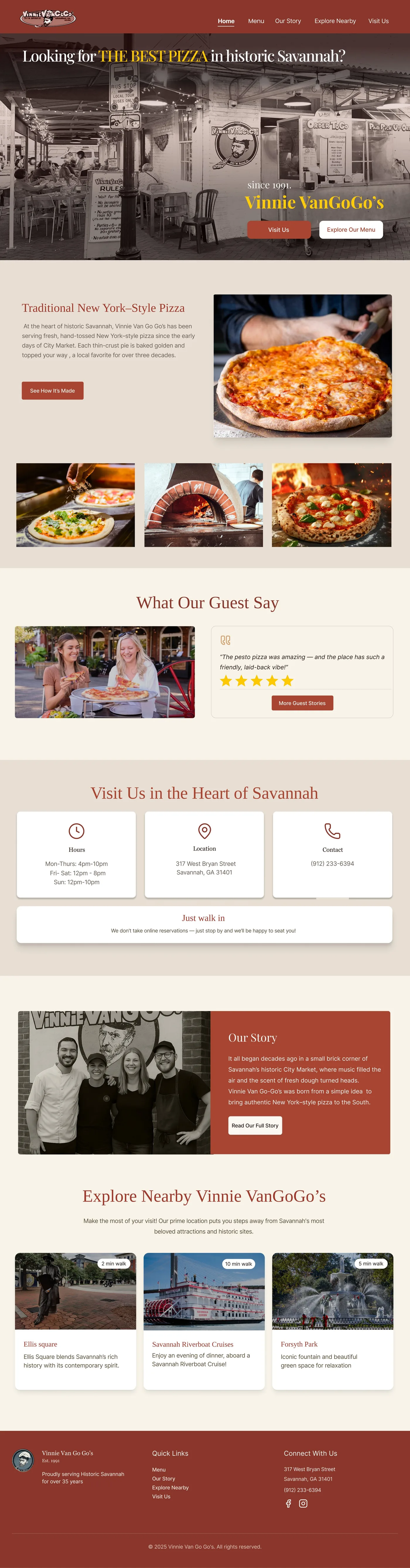
The redesign prioritized what tourists needed most through a clearer information architecture, authentic storytelling, search-driven content, and a welcoming hero section that immediately communicated the restaurant’s identity.
My Role
I built the site’s information architecture and branding, and developed the UX writing. I also contributed to user research, translating tourist needs into a clearer navigation structure, a visual identity rooted in Savannah’s character, and welcoming content that helped visitors discover the restaurant and plan their visit.
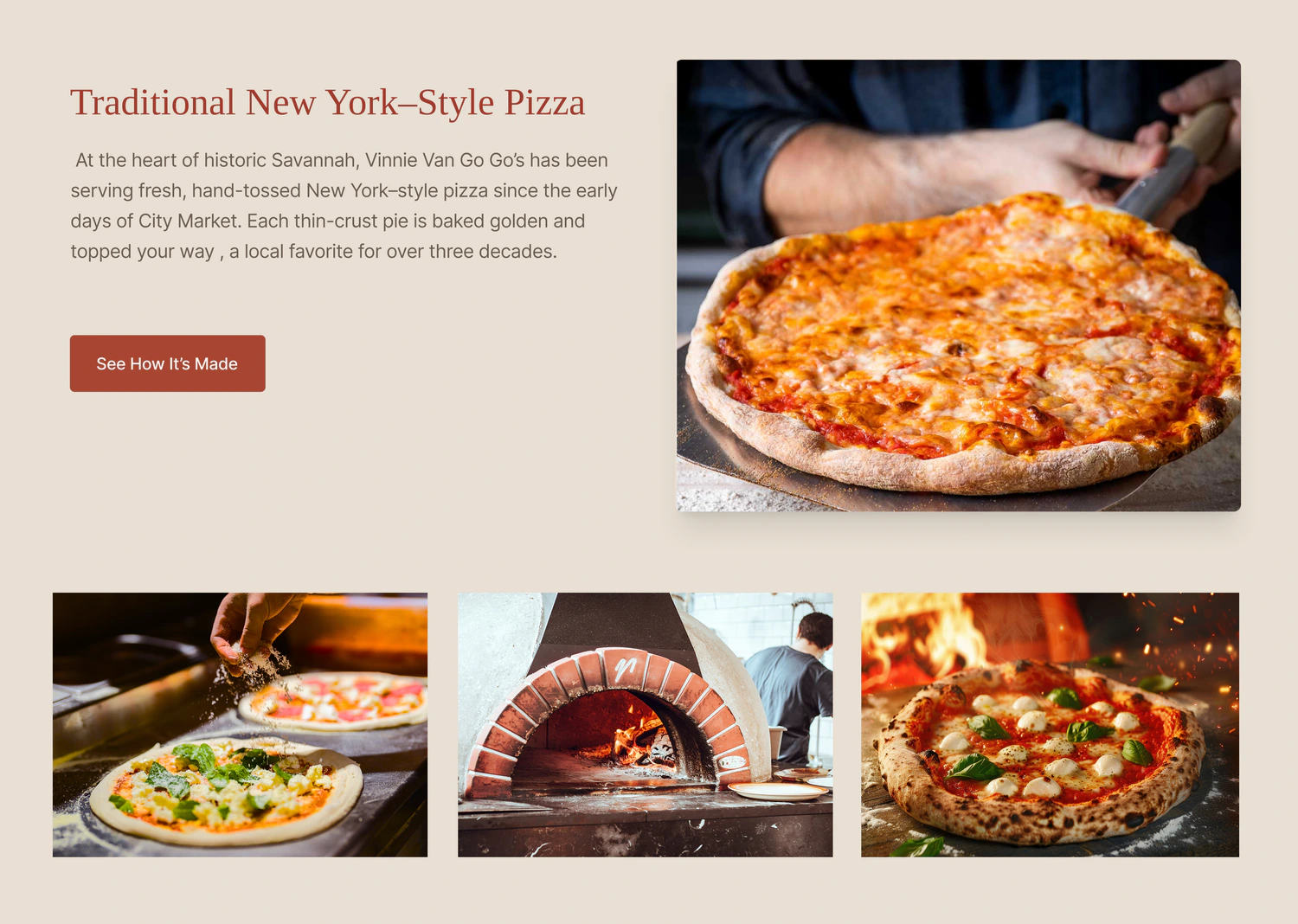
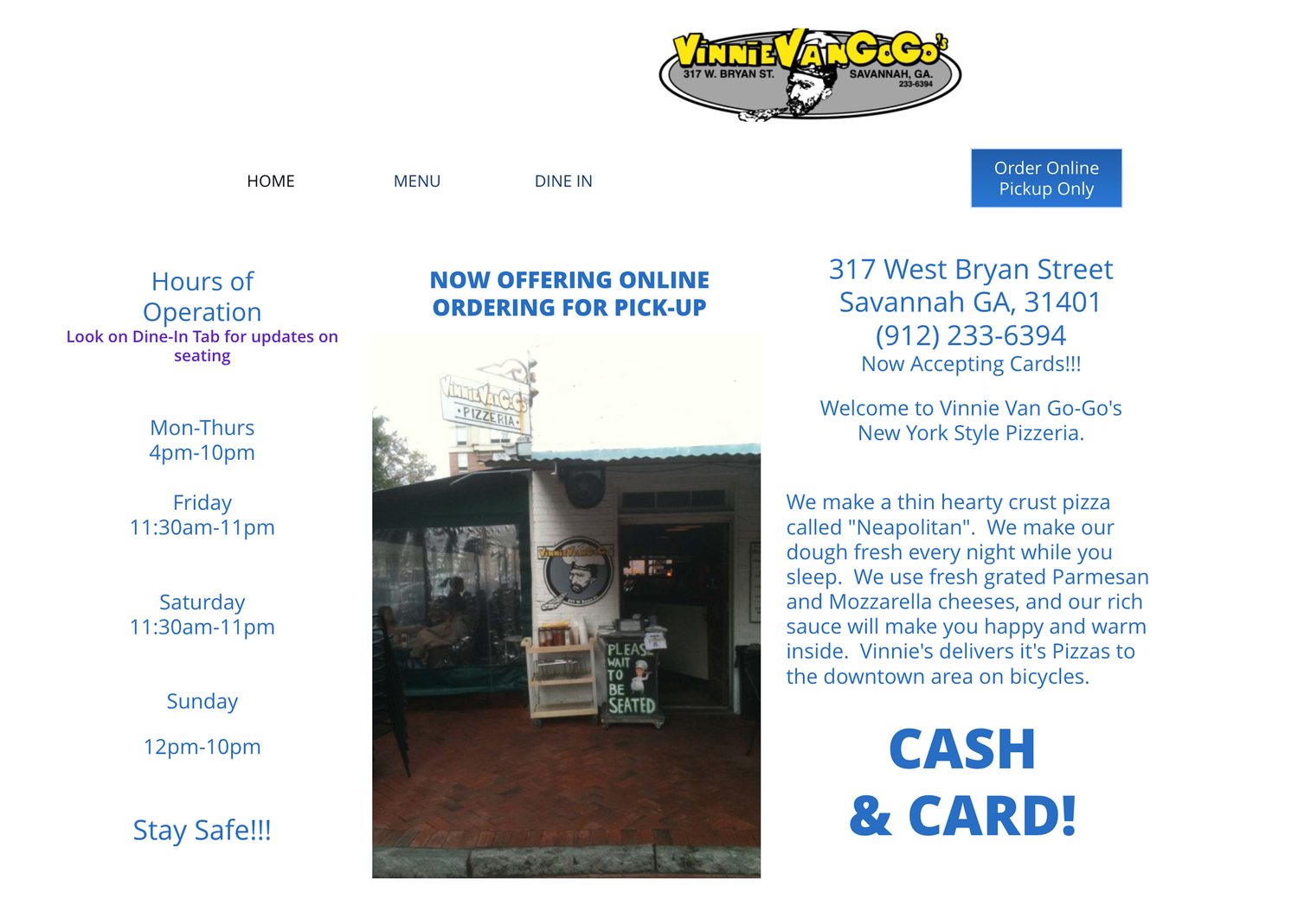
See how it works
Research
Problem statement
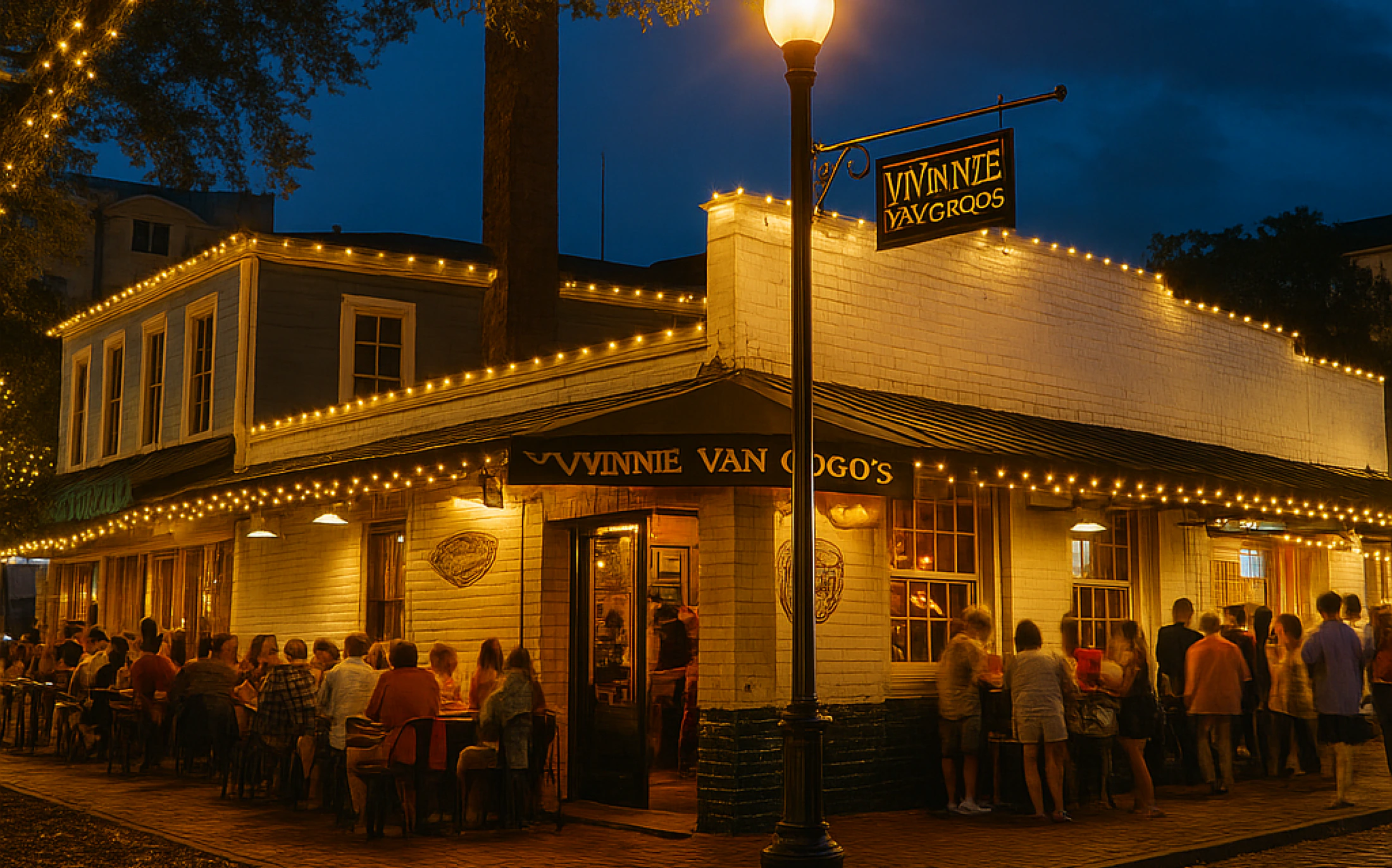
Tourists visiting Savannah seek authentic, historic dining experiences, but often struggle to find clear information about a restaurant’s story, atmosphere, and local identity.
+30Interviews
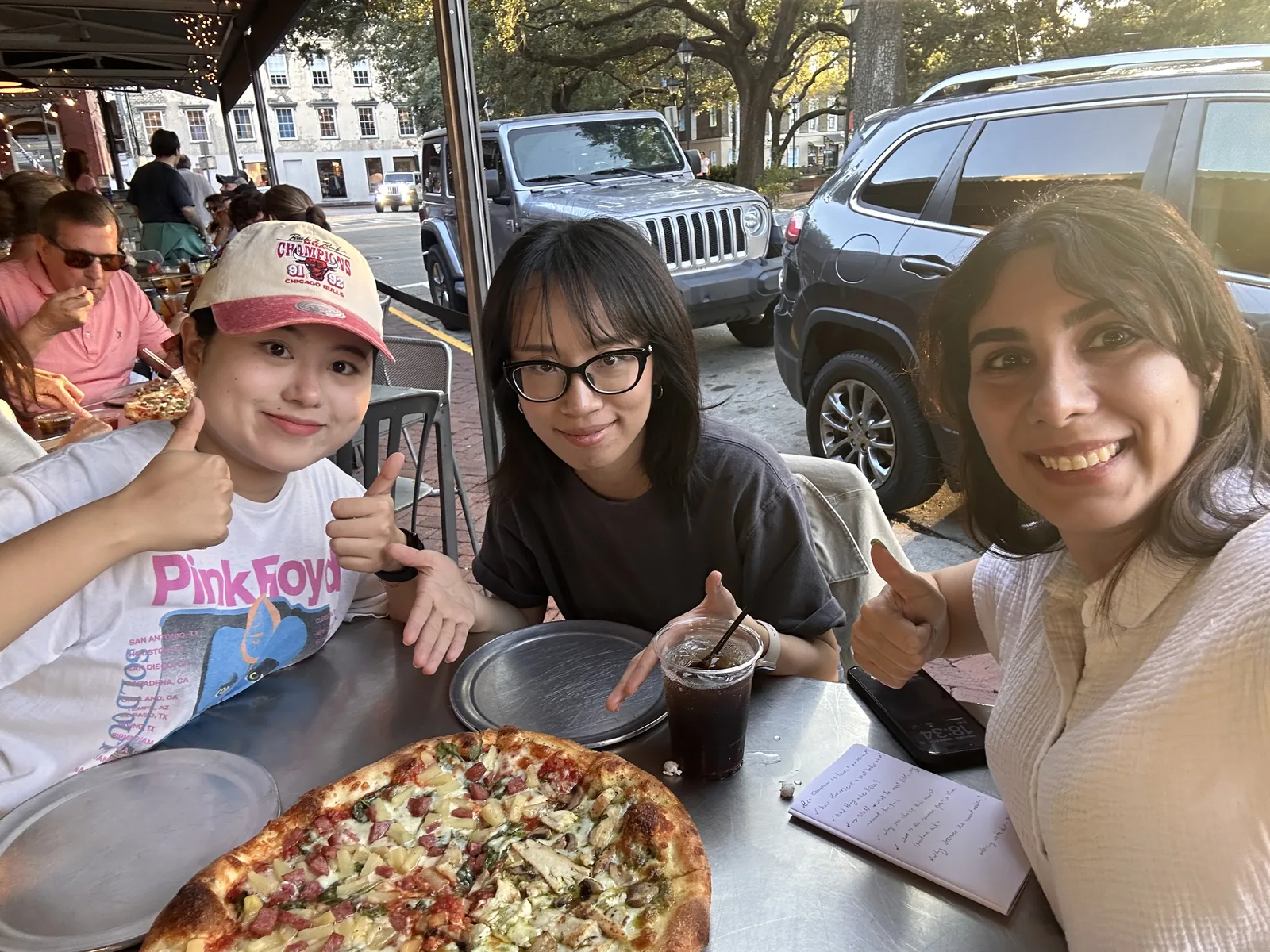
5Hours of Observation
“We looked at their website and thought they hadn’t updated it.”Tourist
“We didn’t know this restaurant had a website.”Local Resident
I don’t just want a good meal, I want to feel the story behind the place.
“We saw someone recommend this place on TikTok.”Tourist
“I saw this place has a high rating on Yelp through Apple Maps.”Tourist
Main research insight
We initially assumed locals were the primary website users. Research revealed that tourists relied on the website to decide whether Vinnie VanGoGo's was worth visiting. This shifted our focus from online ordering to creating a digital experience that helps visitors discover and connect with the restaurant.
How Tourists Make a Decision
-
01
Discover
Understand what the restaurant offers
-
02
Connect
Learn its story and historic identity
-
03
Experience
See the atmosphere and visual character
-
04
Explore
Find nearby landmarks and attractions
-
05
Visit
Plan the trip with location and details
Understanding Tourist Priorities
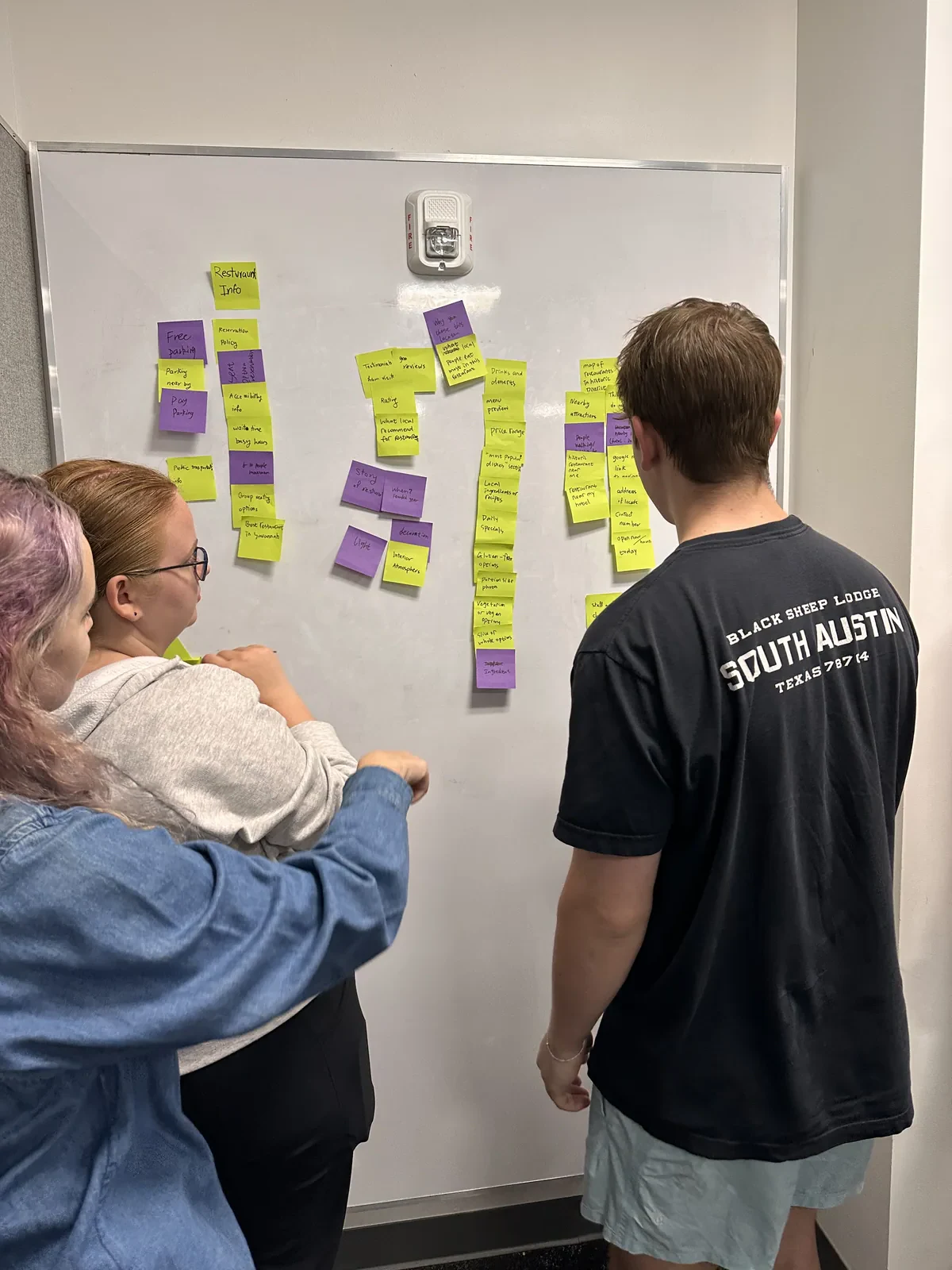
We used card sorting with tourists to uncover how they think about and organize information. These insights revealed what mattered most and guided the foundation of the new website structure.
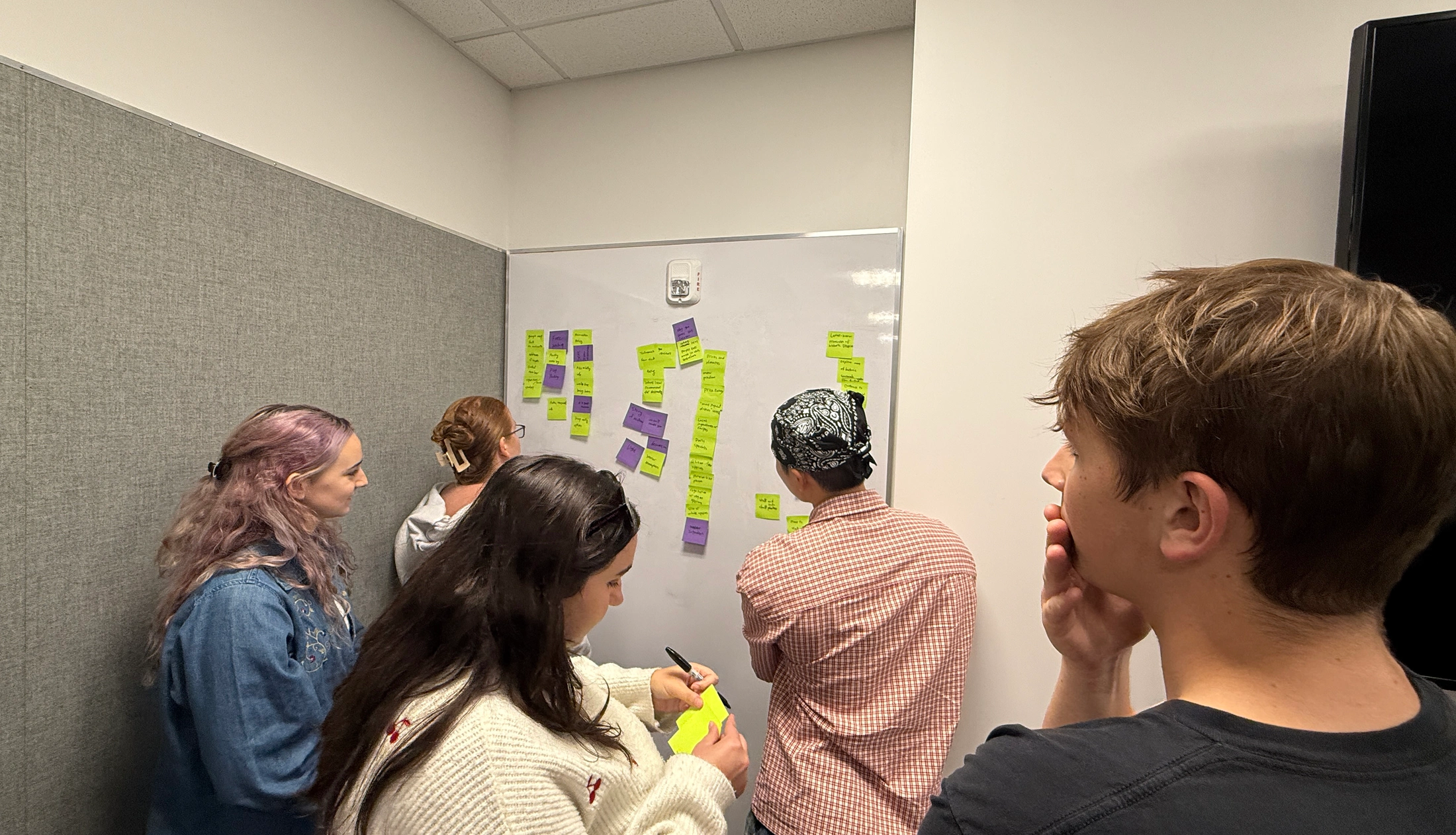
Tourists prioritized menu, location, story, and nearby attractions, shaping the new information architecture.
Development
Turning Insights Into Structure
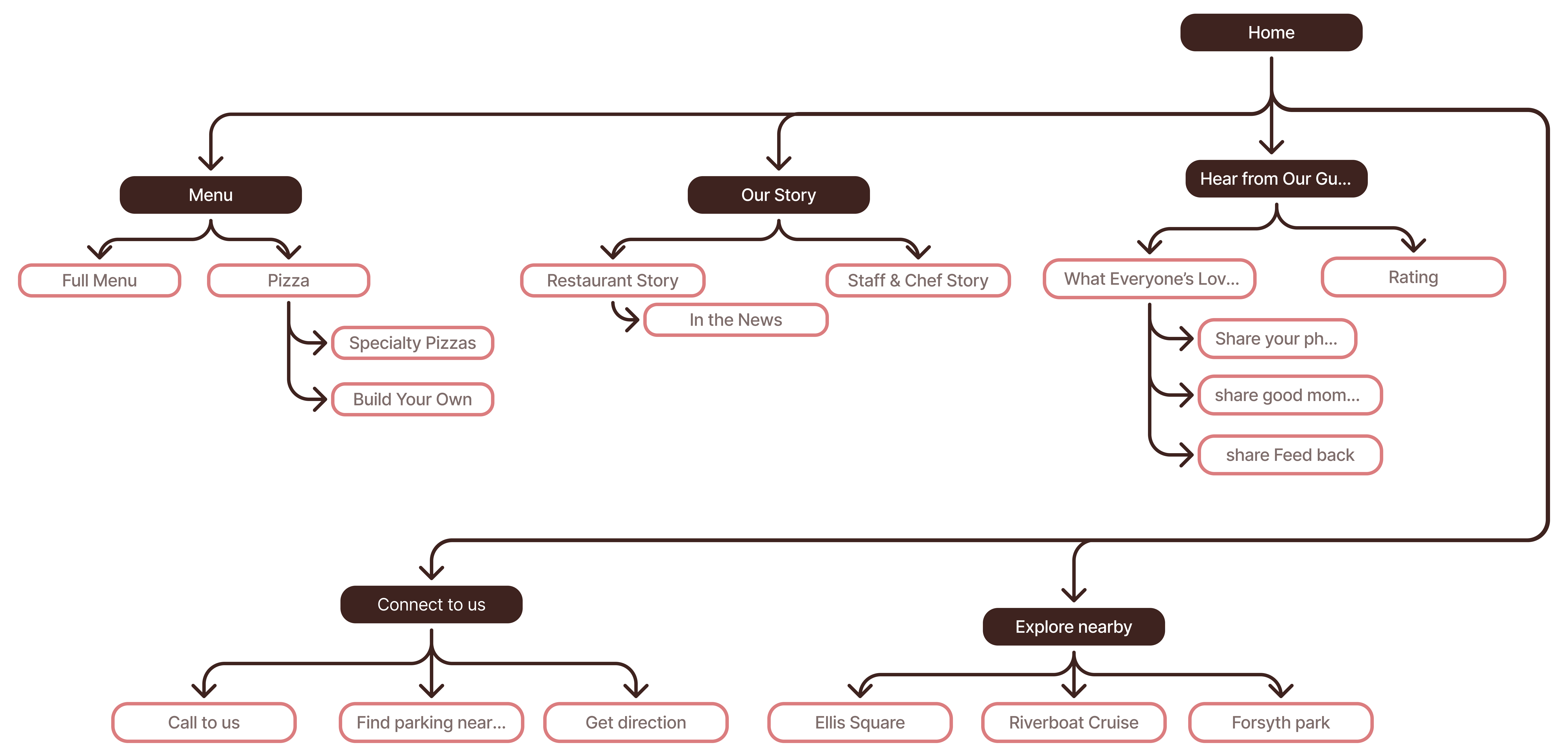
Based on these findings, we reorganized the sitemap around the tourist journey, creating clearer paths to discover the menu, understand the restaurant’s story, and plan a visit.
Ideation and Wireframing
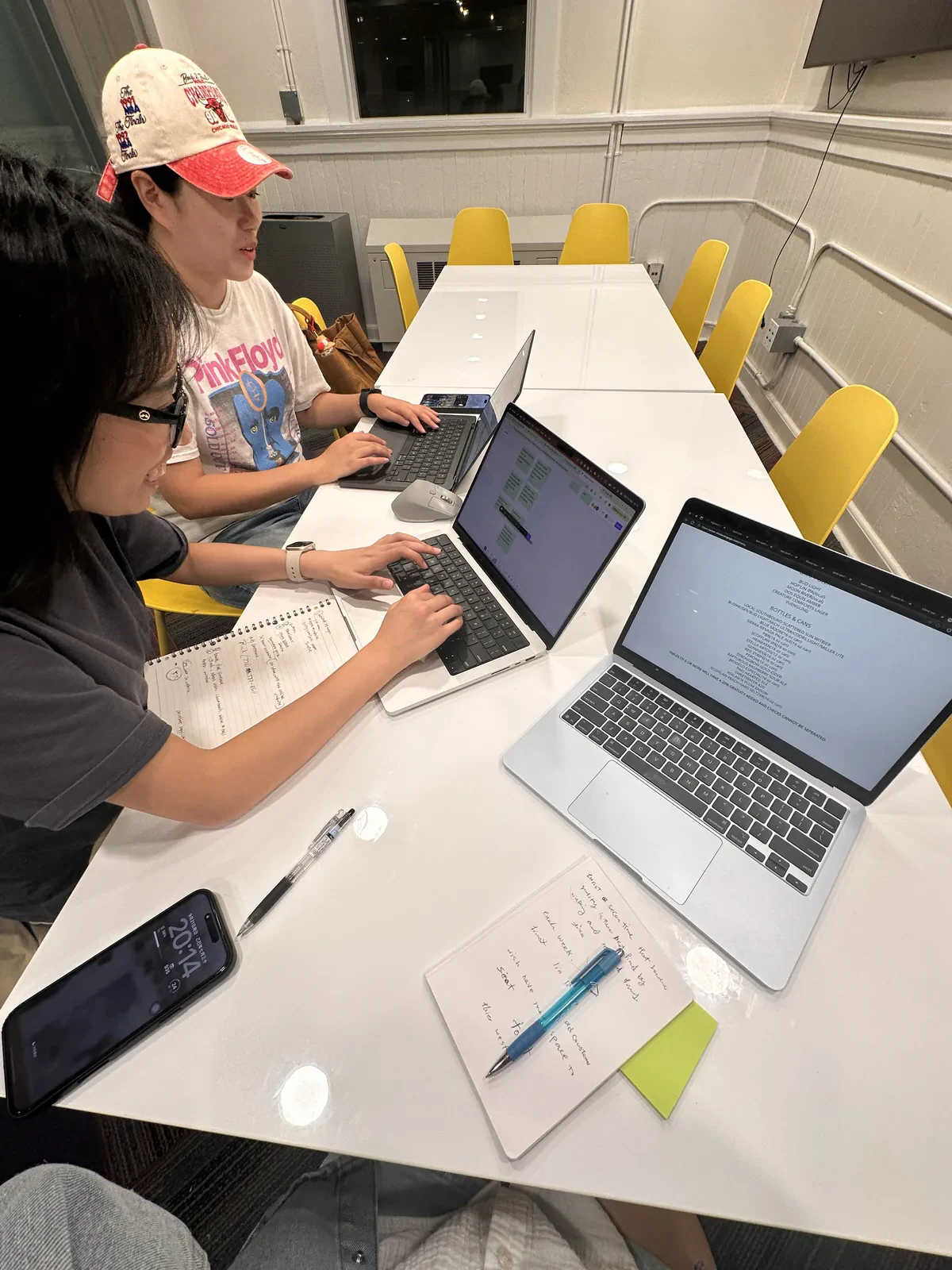
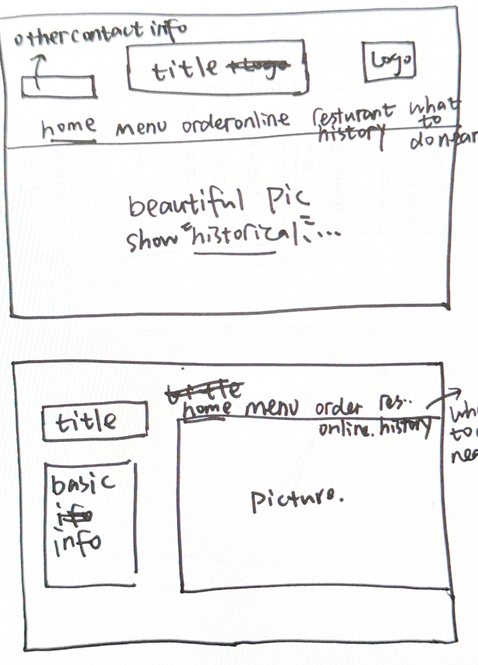
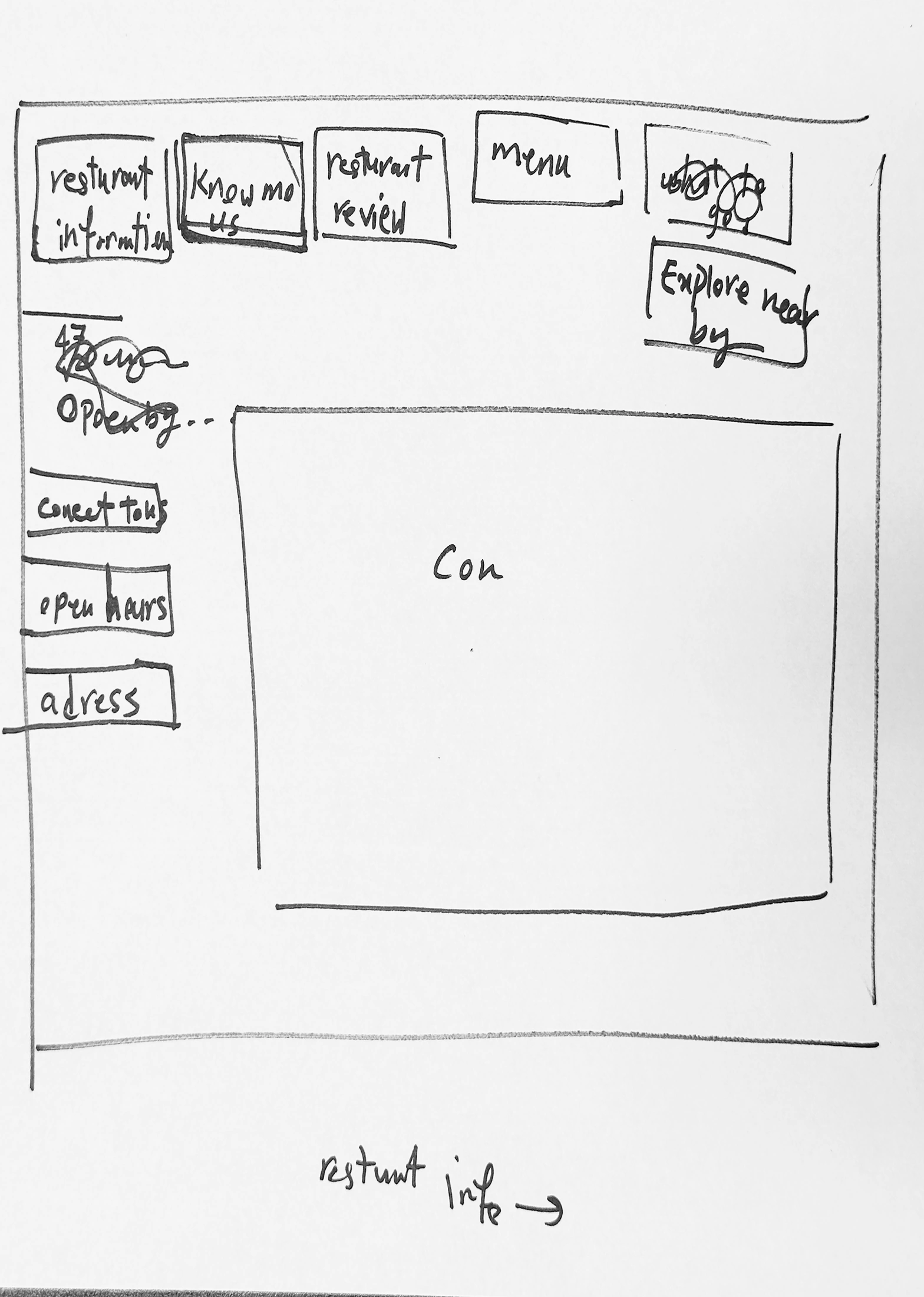
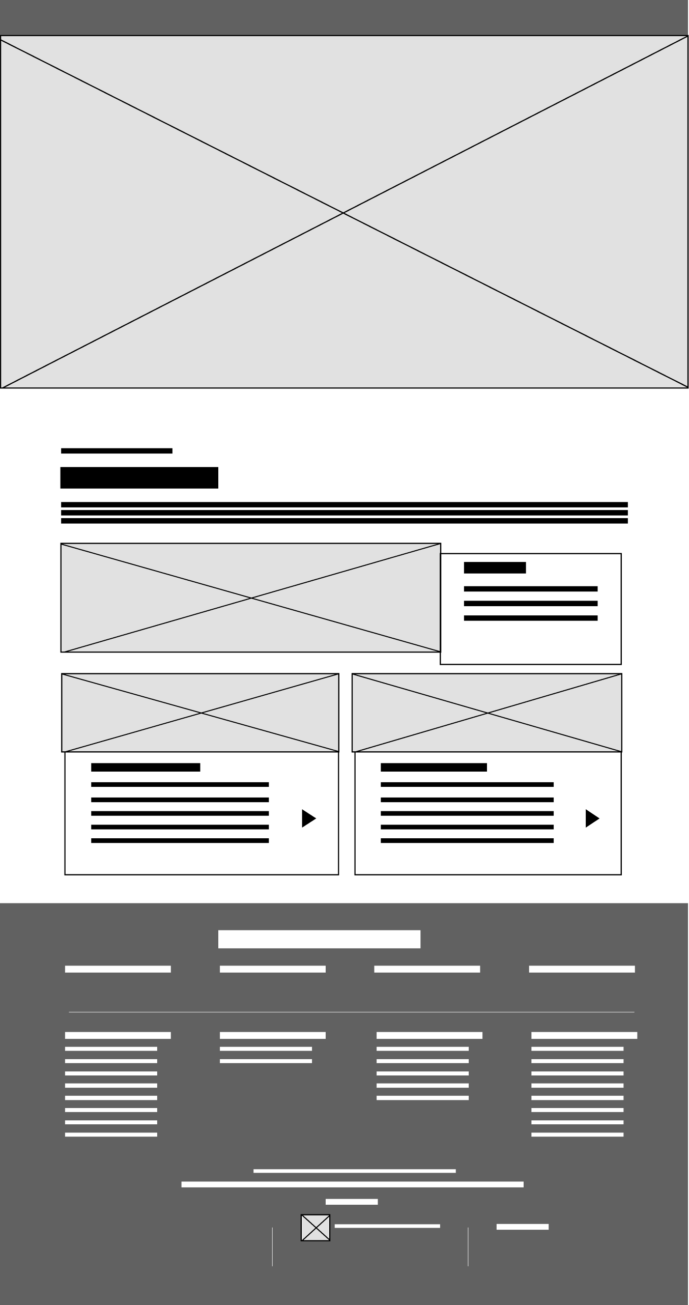
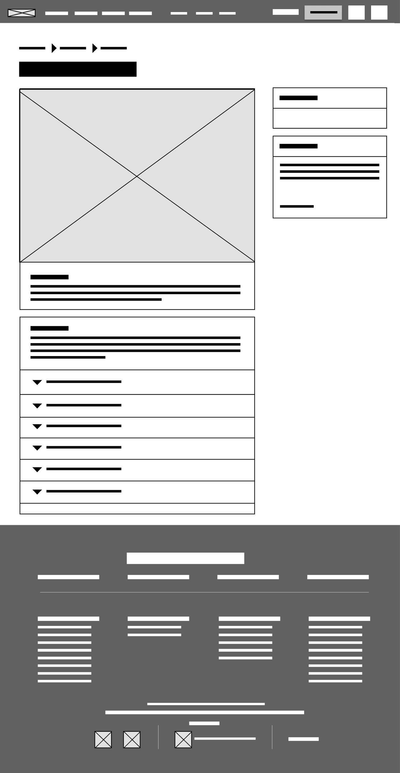
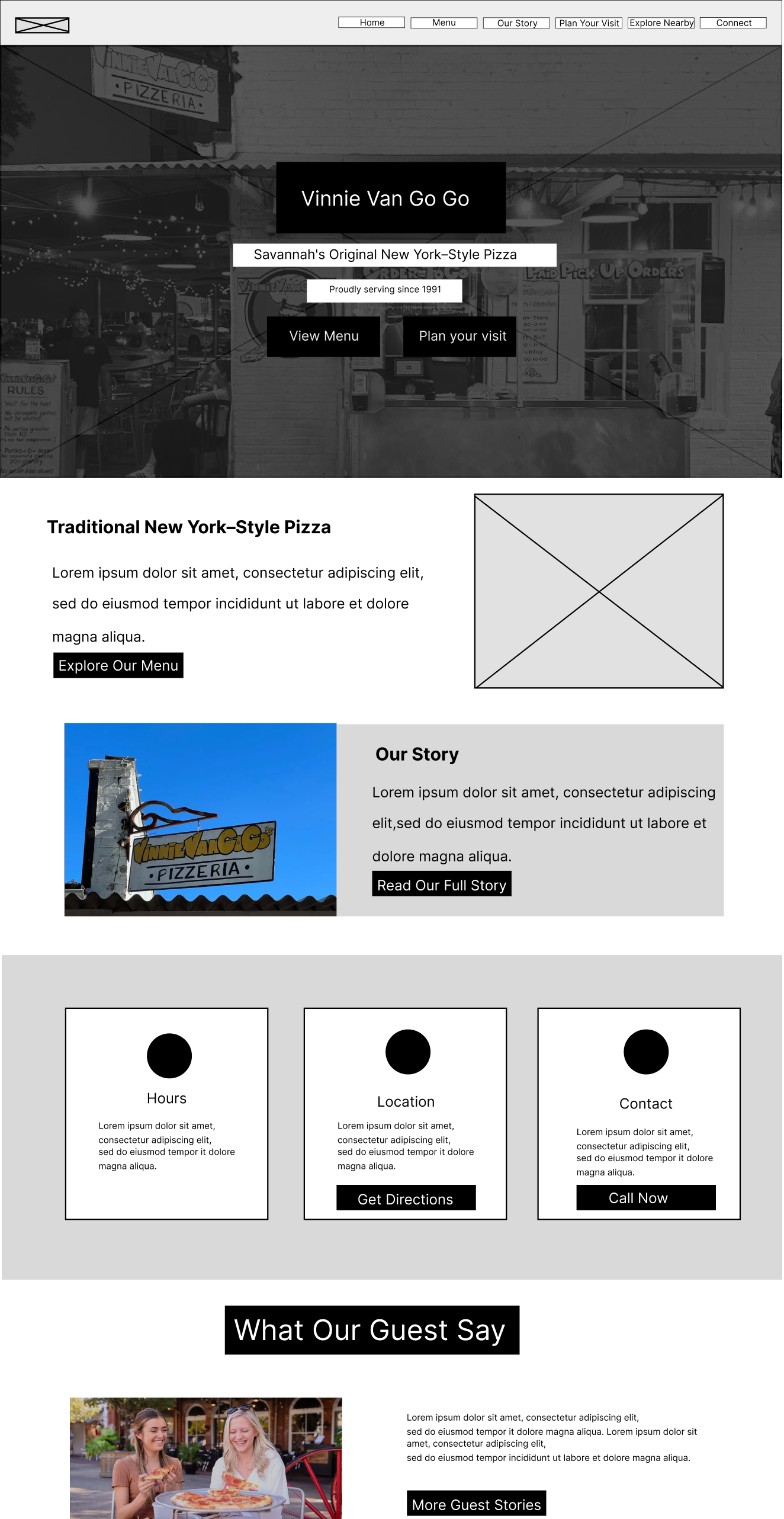
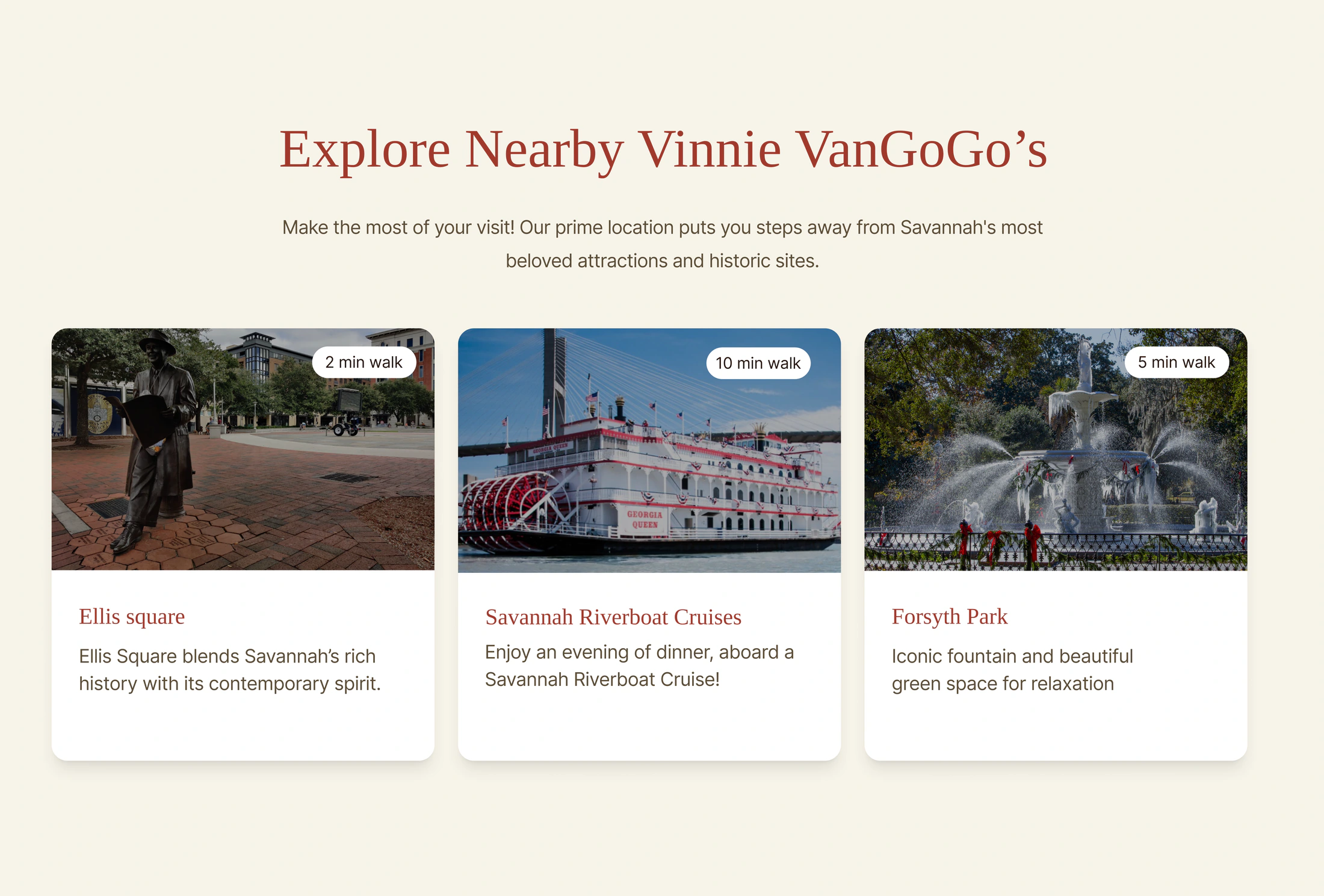
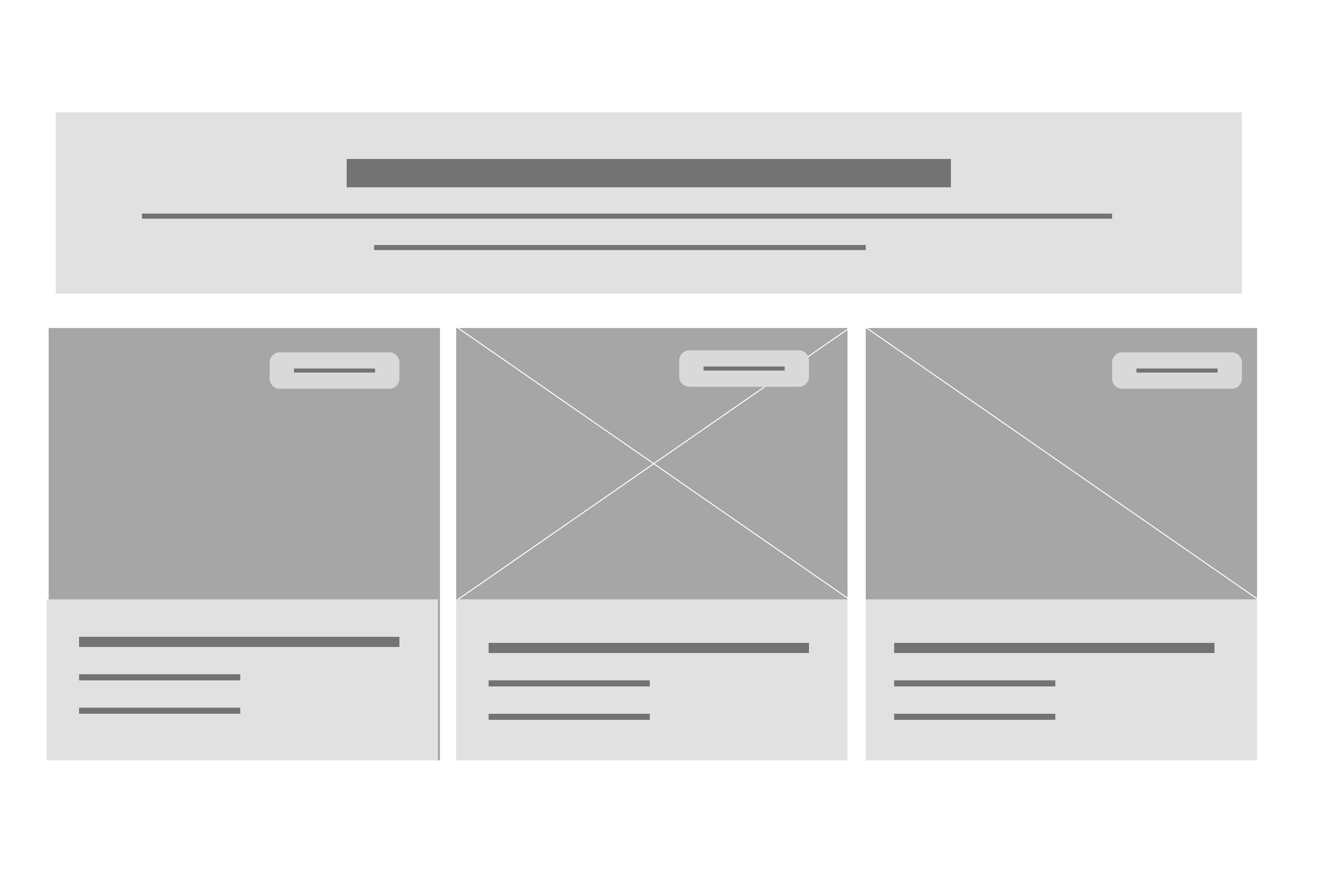
Before designing the interface, we explored multiple concepts through sketches and wireframes to organize content, simplify navigation, and create a clearer experience.
SEO and UX writing
Writing the Way Tourists Search
I researched the phrases tourists searched most such as “best pizza in Savannah,” “historic Savannah restaurant,” and “things to do in Savannah.” Those keywords shaped the headings, navigation, and UX writing, while a friendly tone made the restaurant feel more welcoming.
Designing the Feeling Before the Visit
Based on tourist feedback and visual preference research, We selected brick red, warm cream, and vintage-inspired tones to reflect Savannah’s historic character and create the feeling of the restaurant before the visit.
- Brick Red#A84532
- Warm Cream#E8DFD3
- Vintage Gold#FFC800
Testing
Testing #1
Testing If We Solved the Right Problem
We tested the first prototype with 5 tourists across 3 key tasks to understand if the experience matched their needs. The results revealed areas where visitors struggled with navigation, finding key information, and planning their visit.
Iteration
Turning User Feedback Into a Better Experience
User testing revealed where tourists needed more clarity when discovering the restaurant and planning their visit. We refined the design to make key information easier to understand and access.
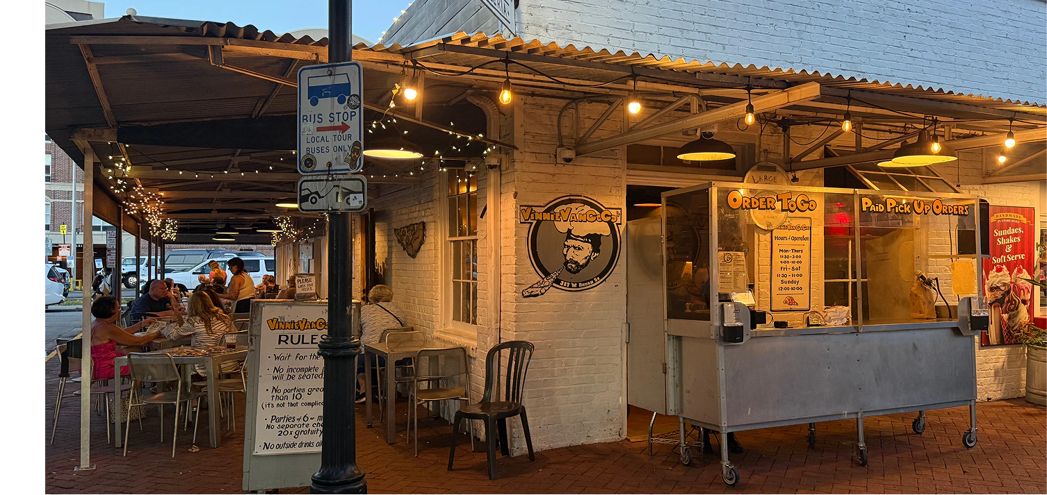
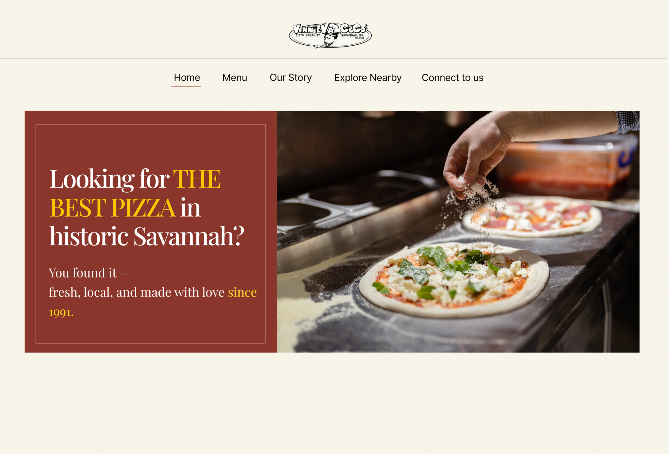
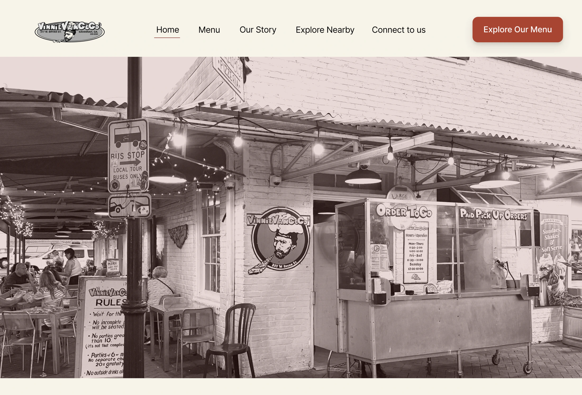
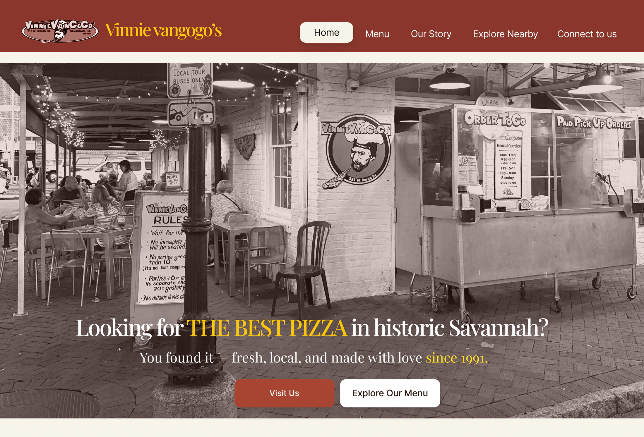
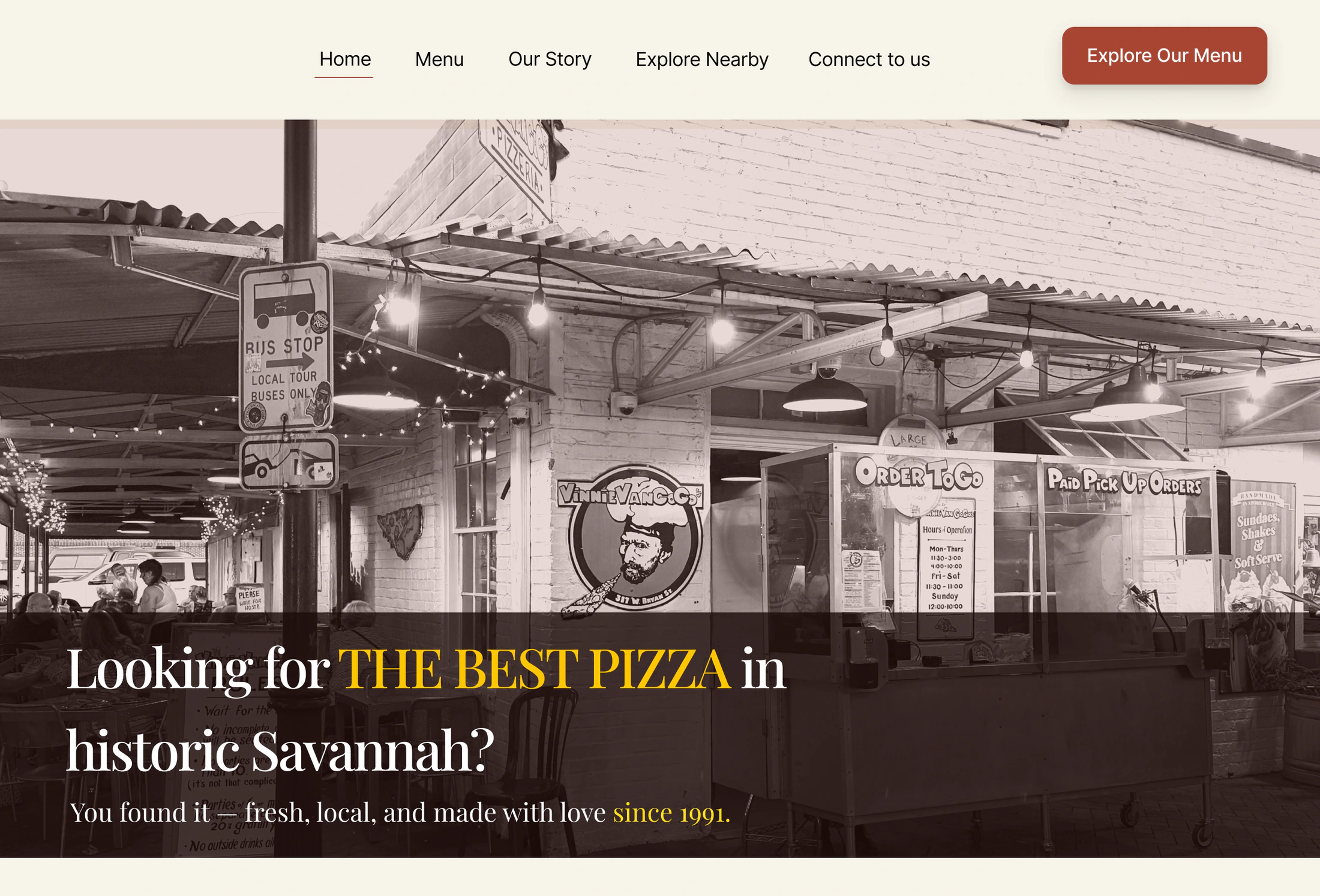
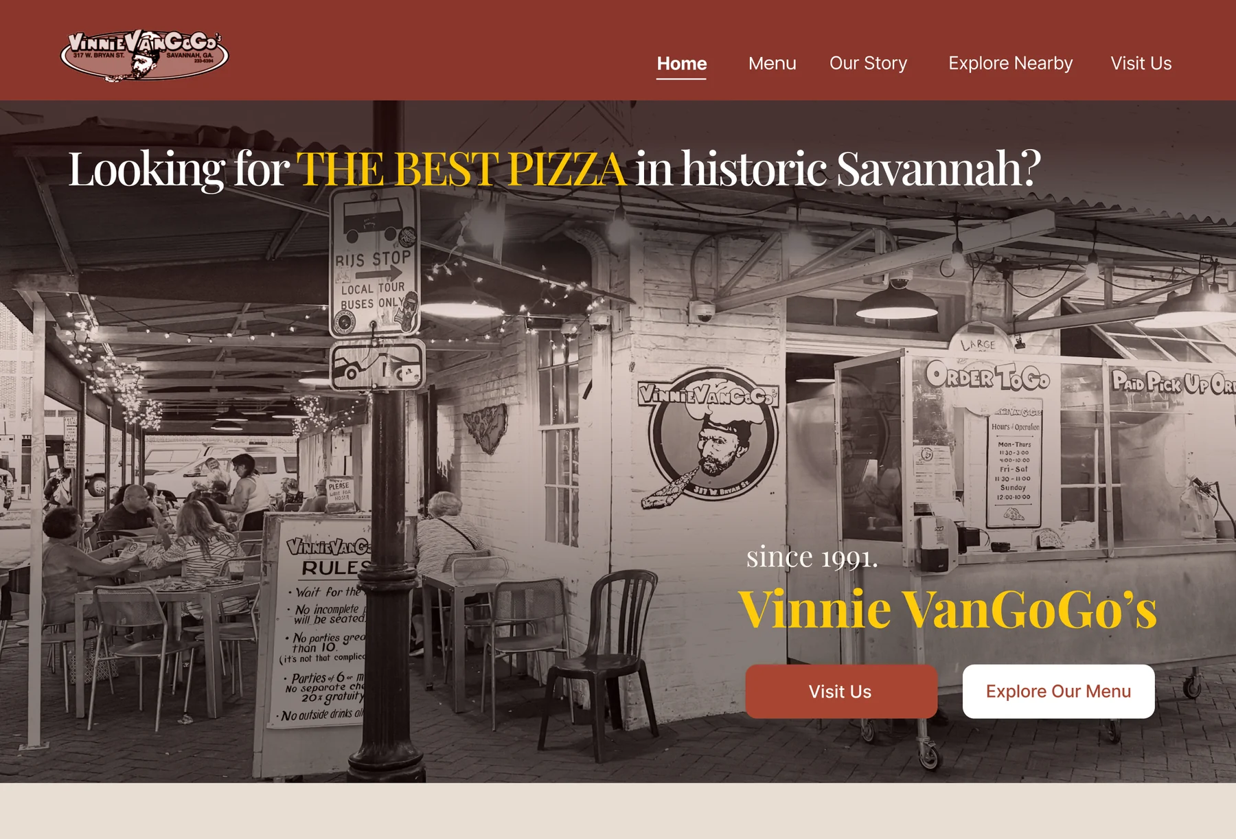
Hero Image
Replaced the image to better capture the restaurant’s historic atmosphere and first impression.
Hero CTAs
Added “Explore Our Menu” and “Visit Us” to help tourists quickly access the information they need.
Navigation Label
Changed “Connect With Us” to “Visit Us” to better reflect how visitors plan their trip.
Testing #2
Validating the Improved Experience
A second round of testing confirmed that the redesign better supported tourists in discovering the restaurant, finding key information, and planning their visit.
of participants completed the tasks successfully
Impact
How does the redesign bring more tourists to Vinnie VanGoGo's?
The redesign removed key barriers for first time visitors by improving discoverability, clarifying the restaurant’s identity, and making it easier for tourists to confidently choose Vinnie VanGoGo’s.
Visitors Found What They Needed Faster
93% of users successfully completed key tasks during testing.
How A clearer information architecture helped users quickly find the menu, location, story, and essential details.
Tourists Recognized Its Historic Identity
Visitors understood what makes Vinnie VanGoGo's unique.
How The hero section, historical imagery, and storytelling highlighted its heritage and Savannah character.
Visitors Explored More of Savannah
Tourists could discover more around the restaurant.
How The Explore Nearby feature connected Vinnie VanGoGo's with nearby historic landmarks.
The Website Became Easier to Discover
The experience better matched how tourists search online.
How UX writing and SEO improvements aligned content with visitor search needs.
Reflection
This project helped me understand the importance of structuring information and designing clear information architecture. I learned that even simple content becomes difficult to use when it is not organized around user needs, especially for first time visitors.